

01 · Hero
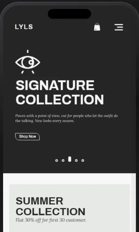
Every visit starts with a look.
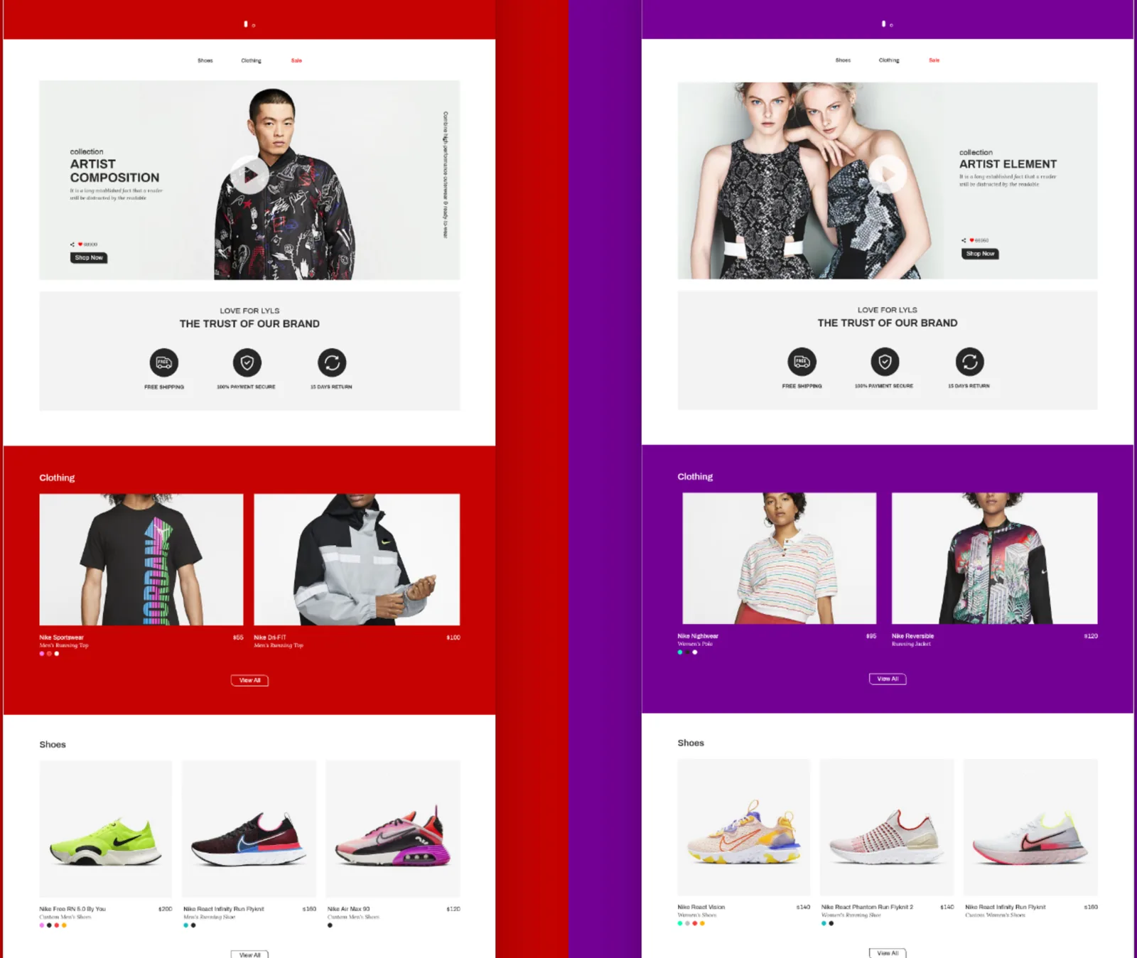
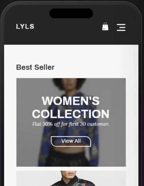
A carousel of signature looks, the eye above the collection name, one button: Shop now.
Why: the product is the hero. The brand steps back to a mark and a line.
02 · Collections
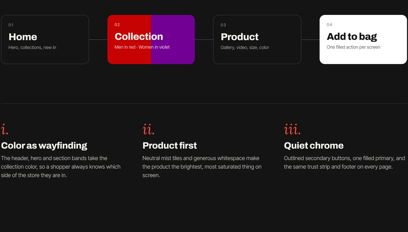
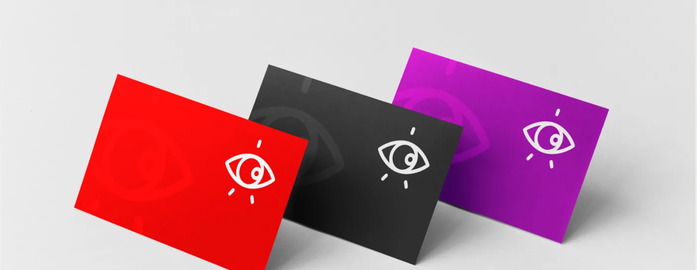
Colour as wayfinding.
The header, hero and section bands take the collection colour. A shopper always knows which side of the store they are on.
Why: two audiences, one catalogue. Colour sorts it before any label does.
03 · Product first
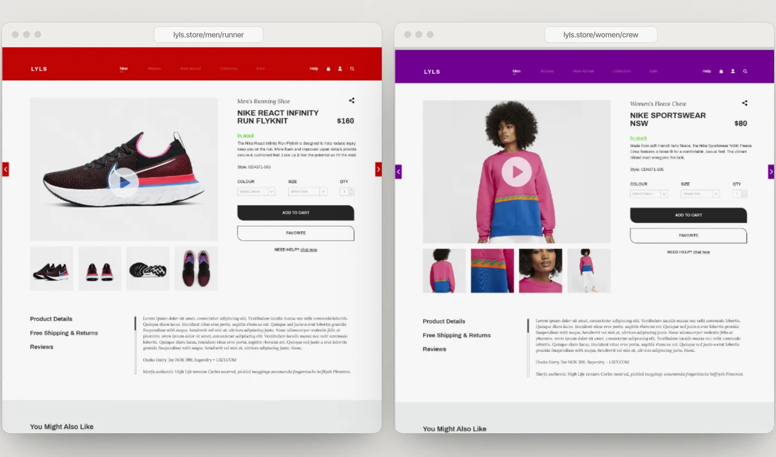
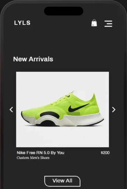
Quiet chrome.
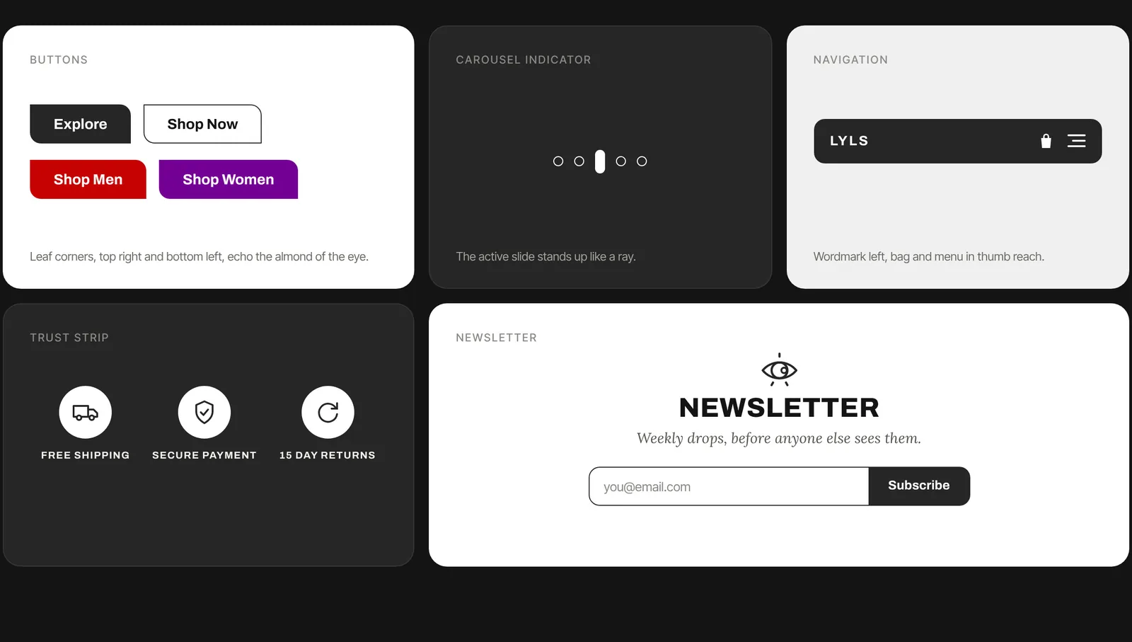
Neutral mist tiles and generous whitespace make the product the brightest thing on screen. Outlined secondary buttons, one filled primary.
Why: the same trust strip and footer on every page means nothing has to be relearned.
04 · Newsletter
Weekly drops, before anyone else sees them.
The eye above a single field. The last thing on the page is the brand idea, not a form.
Why: one field, one line, in the brand's own voice.