Case study 01Product design · UX · UI · Build

Elyonexus. A website that sells a feeling.

Edmonton's newest VR game park had no photos, no reviews and no bookings yet. We designed the product strategy, UX, UI and front end that had to win trust before the doors opened.

Product designUX research & flowsUI & design systemMotionFront-end build
elyonexus.com
Client
Elyonexus VR Game Park
Location
Edmonton, Canada
Industry
Entertainment, VR
Year
2026
Live
00 Overview

Selling something most people have never tried.

Free-roam VR is new to most of Edmonton. The site had to explain five very different experiences, reassure parents and HR managers, and turn curiosity into a waitlist, all before launch day.

Challenge

No proof yet

No venue photos, no reviews and online booking switched off until opening. Every usual trust signal was missing.

Approach

Craft as proof

Lead with the feeling, then remove every doubt: real product renders, honest pricing, a four-step visit story and answers placed exactly where questions appear.

Outcome

Launch-ready

A 13-page product with experience pages, group packages, gift card commerce and a waitlist, built so booking switches on the day the doors open.

0Pages designed and built
0Experiences on one template
0Audiences, one site
0Guests in a private buyout
01 Process

From brief to launch in six moves.

Each phase ended with a decision the client signed off, so design never ran ahead of strategy and the build never ran ahead of design.

01

Discover

Understand the venue, the offer and the city.

  • Stakeholder sessions
  • Offer & pricing review
  • Audience questions
02

Define

Agree what the site must achieve.

  • Goals & constraints
  • Proto-personas
  • MoSCoW scope
03

Structure

Shape the paths people take.

  • Journey map
  • Sitemap
  • User flows
04

Design

From grey boxes to cinema.

  • Wireframes
  • Visual direction
  • Design system
05

Build

Code that matches the design.

  • Responsive front end
  • Motion & states
  • Stripe checkout
06

Launch

Go live in two phases.

  • Waitlist live now
  • Booking at opening
  • SEO & blog
Chapter one

Product design.

Before any pixels: what problem are we solving, for whom, and what must ship first.

Problem framingGoals & success measuresConstraintsPrioritisationPhased roadmap
Problem statement

People in Edmonton can't picture what free-roam VR feels like, and parents, friends and HR managers each need a different reason to trust a venue that hasn't opened yet.

GOAL 01

Make the feeling visible

Show what each experience is like before anyone has tried one.

Measured by experience page views per visit
GOAL 02

Capture demand pre-launch

Turn curiosity from social into a list the venue owns.

Measured by waitlist sign-ups
GOAL 03

Win the big bookings

Parties and corporate groups bring the largest orders.

Measured by event enquiries
GOAL 04

Answer before they ask

Reduce the questions staff answer by phone and DM.

Measured by FAQ use vs contact forms
No venue photosThe studio was still being fitted out.→ Product renders and character art carry the visuals
No reviewsNobody had visited yet.→ Trust from transparent pricing and clear rules
Booking offPayments switch on at opening.→ "Get First Access" waitlist as the primary CTA
Three audiencesFamilies, friends and companies.→ One spine, three dedicated entry points
How might we
HMW 01

How might we let someone feel a VR ride through a phone screen?

HMW 02

How might we make a parent feel safe booking for their kids?

HMW 03

How might we make a 40-person team event feel easy to plan?

Scope MoSCoW prioritisation

What ships first, and why.

Scope was cut by one question: does this help someone trust us or book us before opening? Everything else waited.

Must5
Experience pagesOne per ride, one template
Transparent pricing"From $39" beside every decision
Waitlist capturePre-launch primary action
Party & corporate pagesPackages with every inclusion
Mobile-first layoutsMost traffic comes from social
Should4
Gift card shop12 designs, $20 to $1,000
Game libraryFilter worlds by mood
FAQ with filtersBooking, safety, pricing
Cart & Stripe checkoutReady, switched on at launch
Could3
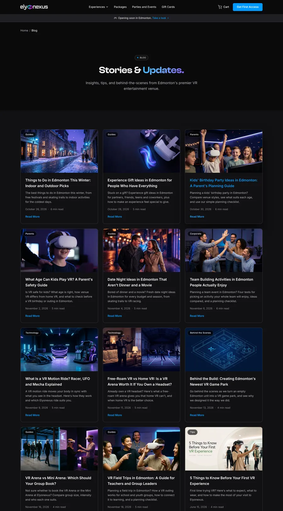
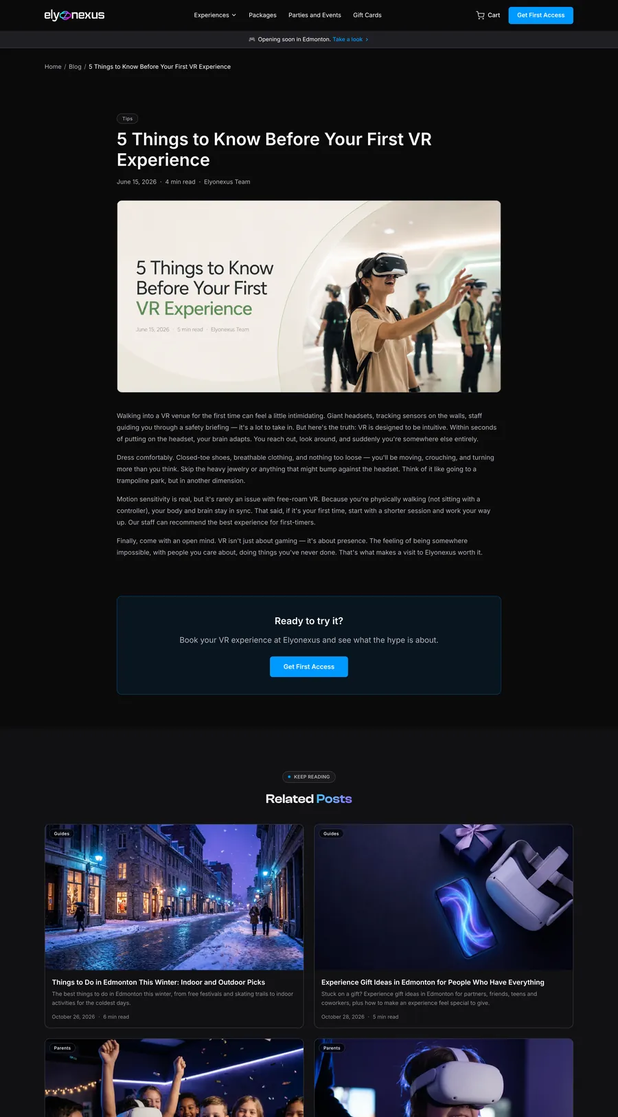
Blog & guidesSEO for first-timer searches
Business gift cardsClient and team rewards
Motion polishMarquee, reveals, hovers
Later2
Real reviewsOnce guests have visited
Venue photographyAfter fit-out completes
Live nowPhase 1 · Pre-launch

Build demand

  • Every page, package and price published
  • "Get First Access" waitlist on every page
  • Gift cards on sale
Phase 2 · Opening

Convert demand

  • Book buttons switch on, no redesign needed
  • Waitlist gets first access to slots
  • Real photos and reviews replace renders
Chapter two

UX design.

Who is visiting, what they're worried about, and the shortest honest path from curious to booked.

Proto-personasJourney mapInformation architectureUser flowsWireframes
PM

The planner parent

Organising a 9th birthday for 10 kids
Is it safe for my kids, and what will it actually cost?
Needs
Age rules, supervision, an all-in party price
Worried about
Hidden fees, kids getting scared or hurt
Finds us via
Instagram, Google, other parents
Design answer: Party package with host, ages 6+ and pricing shown upfront
FT

The curious first-timer

Planning a Saturday with 3 friends
What will it actually feel like? Will I look silly?
Needs
To picture each ride, short sessions, group combos
Worried about
Motion sickness, needing gaming skills
Finds us via
TikTok, Reels, friends
Design answer: Cinematic ride pages and "No VR experience needed" where doubt appears
HR

The HR organiser

Booking a team day for 30 people
Can it handle my whole team properly, and invoice us?
Needs
Capacity, AV, branding, invoicing, a fast quote
Worried about
Looking unprofessional in front of leadership
Finds us via
Google, LinkedIn, colleagues
Design answer: Buyout and offsite tiers for up to 40, GST invoicing and a 24h proposal

Proto-personas built with the client from stakeholder sessions and the questions their team expected to hear most. They will be validated with real guest feedback after opening.

UX Journey map

Where doubt peaks, design steps in.

We mapped the first-timer's path from a Reel to a booking. The dip is the moment people leave, so that's where the strongest design answers sit.

Stage
DiscoverSees a Reel
ExploreLands on site
EvaluateCompares, worries
DecidePicks a package
Book & sharePays, tells friends
Thinking
"That looks unreal. Is it in Edmonton?"
"What are these rides, exactly?"
"Will I get sick? Is it worth $39?"
"Which combo is right for 4 of us?"
"Done. Sending this to the group chat."
Feeling
Pain point
PAINAd hype, no context
PAINFive unfamiliar ride names
PAINSafety, sickness, price doubts
PAINToo many package options
PAINBooking not open yet
Design answer
ANSWERHero says "Edmonton" in the first line
ANSWERRide cards with renders and a one-line promise
ANSWER"Book, show up, play" steps, FAQ, ages 6+
ANSWERThree tabs: solo, party, corporate
ANSWERWaitlist with first access to slots

UX Information architecture

Every path ends at a booking.

Fourteen pages grouped by intent: explore, plan a group, or give a gift. Each page has exactly one primary action.

HomeHero · rides · steps · packages · waitlist
ExperiencesExplore intent
VR ArenaFree-roam, up to 6
Mini ArenaDuos
Flash Racer · UFO · MechaMotion rides
Game libraryFilter by mood
PackagesBook intent
CombosFrom $39
CartReview
CheckoutStripe Canada
Parties & EventsGroup intent
Party & Team8+ guests
Private BuyoutUp to 40
Corporate OffsiteProposal in 24h
Gift CardsGift intent
Personal12 designs
BusinessTeams & clients
Blog · FAQ · About · ContactTrust & support
UX User flows

Three intents, three clean paths.

Flows were drawn before screens so every page knew where it sat in a journey and what came next. Choose a flow.

Reel or GoogleEntry point
HomepageHero · rides
Experience pageWhat it feels like
Booking open?Decision
Pick comboFrom $39
CartReview
Stripe checkoutPay
ConfirmedEmail + waiver

Pre-launch branch: when booking is closed, "Book" becomes Get First Access, so the same flow captures the lead instead of hitting a dead end.

LinkedIn or GoogleEntry point
Parties & EventsGroup hub
Compare tiersParty · Buyout · Offsite
Mon–Thur or Fri–Sun?Price toggle
Learn moreEvery inclusion
Contact our teamHeadcount, date, goal
Proposal in 24hGST invoice ready

The HR organiser never has to email to ask what's included. Capacity, AV, branding and invoicing are visible before the enquiry.

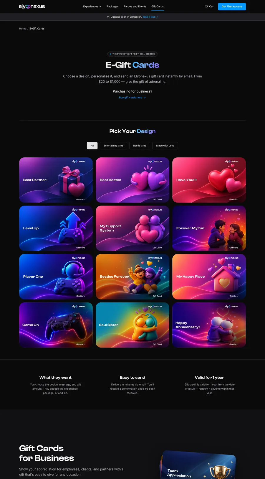
OccasionBirthday, thank you
Gift CardsPersonal or business
Filter by moodBestie, love, gamer
Choose design12 options
Amount & message$20 to $1,000
Send now or schedule?Decision
Delivered by emailValid one year

Gift cards earn revenue before opening, so this flow is fully live in phase one.

Key pageDecisionGoal reached
UX Wireframes

Grey boxes first, cinema second.

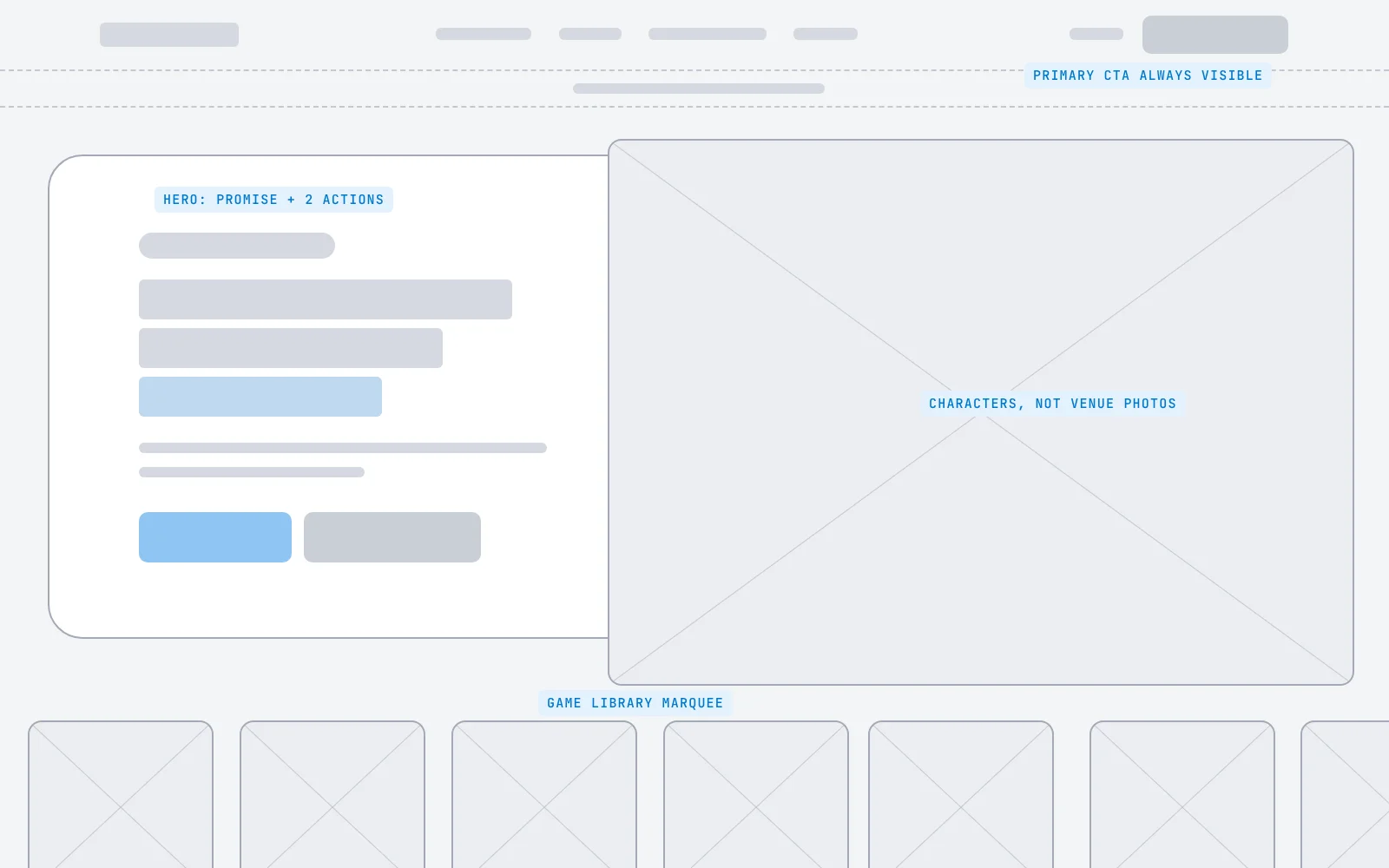
Layout, hierarchy and calls to action were agreed in low fidelity, so visual design could focus on feeling. Drag to compare the wireframe with the final screen.

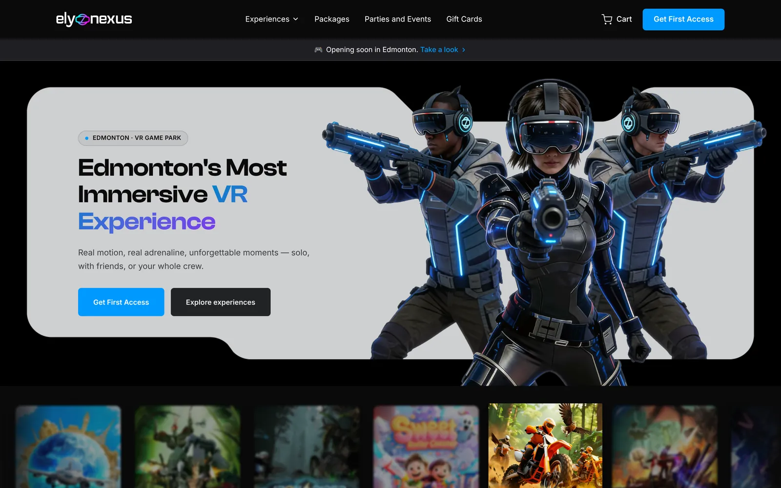
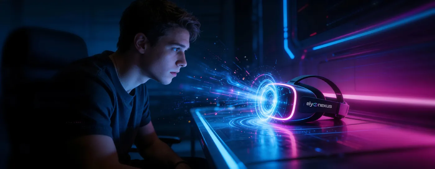
Final homepage hero design
Low-fidelity homepage wireframe
WireframeFinal UI
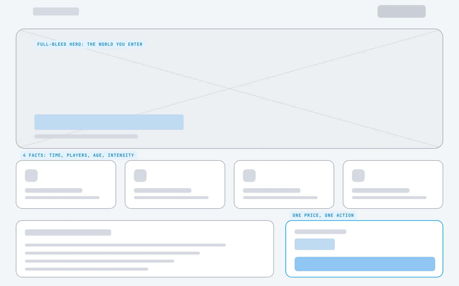
Experience page wireframe
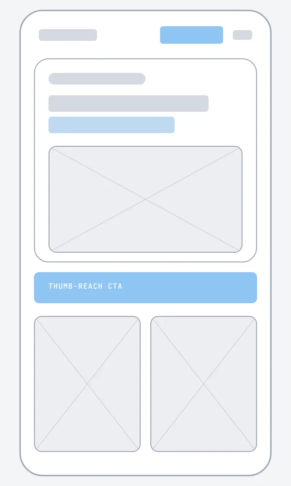
Mobile homepage wireframe
Experience template and mobile home. One template serves all five rides: full-bleed world, four quick facts, a description and a single price card with one action.
Chapter three

UI design.

A dark stage, one electric blue and a gradient saved for the moments that matter. Everything below is live: hover, click and type.

Visual directionColour tokensType scaleGrid & spacingComponents & statesAccessibility
UI Visual direction

Premium, immersive, energetic.

The client's brief in three words, carried through every page of the live site, so it looks like the experience, not like a template.

UI Colour tokens

One blue does the selling.

Near-black lets the art glow. Blue is reserved for actions, so the eye always knows where to click. Click a swatch to copy its value.

Brand gradient#38BDF8 → #6EA8FF → #8B5CF6
UI Typography

Display that shouts, body that reads.

Clash Display brings the game-title energy. Inter keeps prices, rules and FAQs effortless to read on a small screen.

Display XLEdmonton's most immersiveClash 600 · 48/1.1
Display LThree rides. Two arenas.Clash 600 · 32/1.15
TitleVR Magic UFOClash 600 · 26/1.25
Body LReal motion, real adrenaline, unforgettable moments.Inter 400 · 18/1.6
BodyNo equipment to master. No VR experience needed.Inter 400 · 16/1.65
LabelEdmonton · VR game parkInter 600 · 12 caps
UI Grid & spacing

A 12-column grid on an 8px rhythm.

Content sits in a 1152px container. Sections breathe on 96px, cards on 24px. Toggle the grid to see it.

elyonexus.com
Homepage hero with layout grid
8
16
24
32
48
64
96
UI Components & states

Built to be touched. Try them.

Every component has default, hover, pressed, focus and disabled states, and each micro-interaction tells the user something happened.

ButtonsHover · press

Lift and glow on hover, squash on press. Disabled reads as "not yet", not "broken".

Segmented controlClick
Private Buyout · Mon–Thur
$1,499 / 2 hours, up to 16

The knob slides rather than snaps, so the switch feels physical.

Filter chipsClick
Horror worldAdventure worldKids worldEntertainment world

Non-matching worlds fade back rather than vanish, so the layout never jumps.

Input & validationType · submit
Join the fleet for first access.

Focus ring, a gentle shake on error and an inline green confirm. No page reload. Demo only.

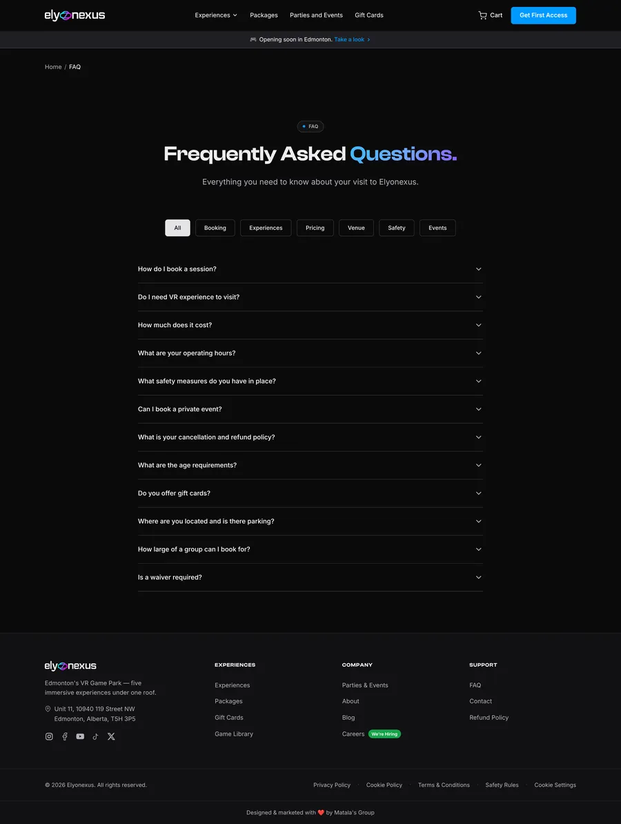
AccordionClick
Not at all. Every session starts with a short briefing from our team.
Ages 6 and up. Guests under 12 need an adult with them.
Yes, free parking right out front in central Edmonton.
Experience cardMove cursor
Elyonexus motion rides
Three rides. Two arenas.

A soft 3D tilt and a light that follows the cursor make the card feel like an object you can pick up.

UI Accessibility

Dark, but never hard to read.

Dark interfaces fail quietly when grey text gets too dim. Every text colour was checked against the page background with WCAG 2.2.

Aa
16.9:1AAA
Signal on Void · headings
Aa
9.6:1AAA
Haze on Void · body copy
Aa
6.2:1AA
Muted on Void · captions
Aa
6.6:1AA
Pulse on Void · links
✓
Reduced motion respectedAnimations switch off when the device asks for it.
✓
Visible keyboard focusA clear focus ring on every interactive element.
✓
Fair cookie choice"Reject optional" has the same weight as "Accept all".
✓
One H1 per pageClean heading structure for screen readers and SEO.
✓
Language declaredCorrect pronunciation for assistive technology.
✓
Search-ready metadataUnique titles and descriptions on every page.
Chapter four

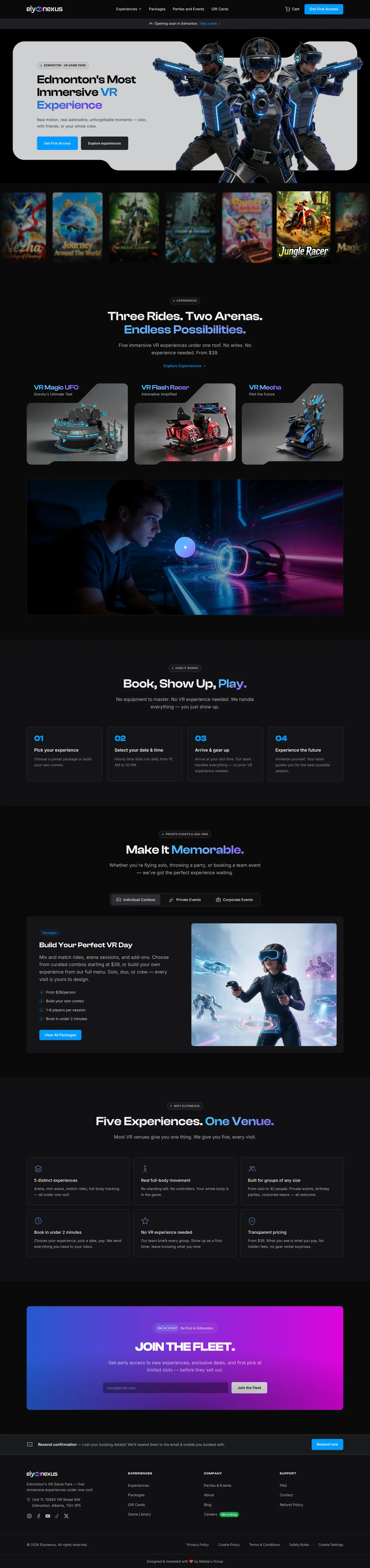
The screens.

Scroll through the homepage. Each section answers the next question a first-time visitor has.

elyonexus.com
Full Elyonexus homepage design
01 · Hero

Sell the feeling first.

Character art bursting out of a light card on a black stage. The headline says where, what and why in one line.

Why: visitors decide in seconds whether a place is "for them". The feeling has to land before any detail.
02 · The rides

Show the product, not the venue.

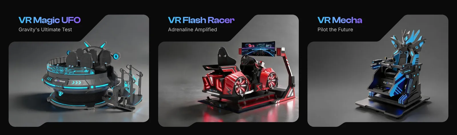
With no venue photos yet, 3D renders of each ride carry the visuals and set honest expectations.

Why: a render of the actual ride beats a stock photo of somebody else's arcade.
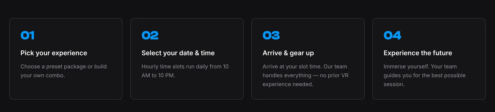
03 · How it works

Kill first-timer anxiety.

"Book, show up, play" turns an unknown visit into four simple steps.

Why: uncertainty is the biggest reason first-timers don't book. Steps make it concrete.
04 · Packages

One tab per audience.

Solo combos, parties and corporate sit in three tabs, each with its own image, promise and action.

Why: three audiences, one page. Tabs let each find their offer without scrolling past the others.
05 · Waitlist

Capture demand before launch.

"Join the Fleet" gets the strongest gradient on the page and asks for just one field.

Why: before opening, an email is the most valuable thing a visitor can give.
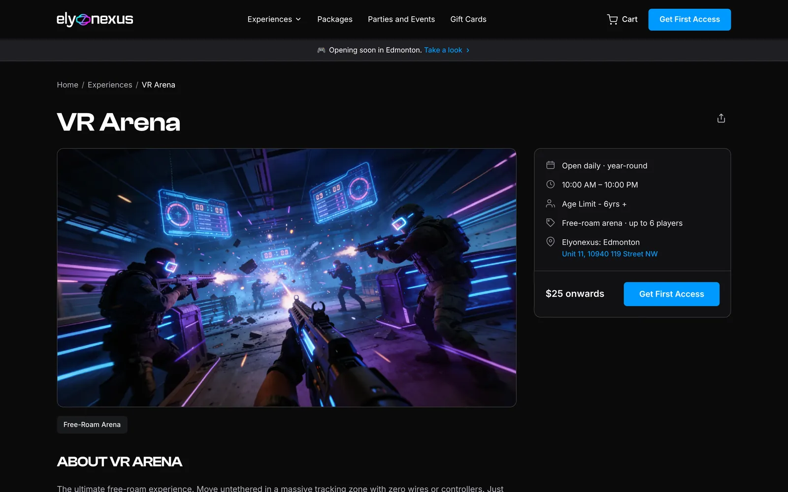
Screens Experience pages

Every ride gets its own stage.

One template, five worlds. Drag to browse.

elyonexus.com/experiences/vr-arena
VR Arena page
VR Arena. Free-roam squad battles for up to six.
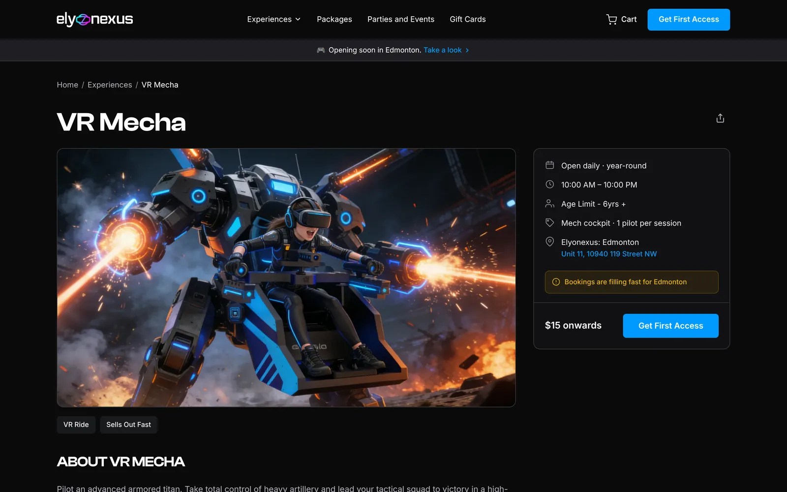
elyonexus.com/experiences/mecha
VR Mecha page
VR Mecha. One pilot, one giant machine.
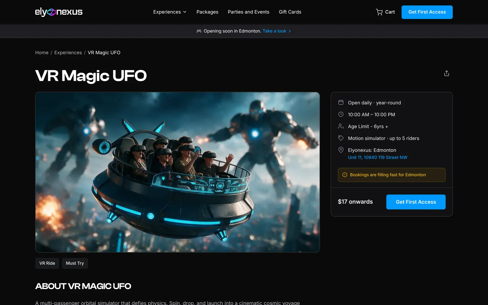
elyonexus.com/experiences/vr-magic-ufo
VR Magic UFO page
VR Magic UFO. A cosmic ride for up to five.
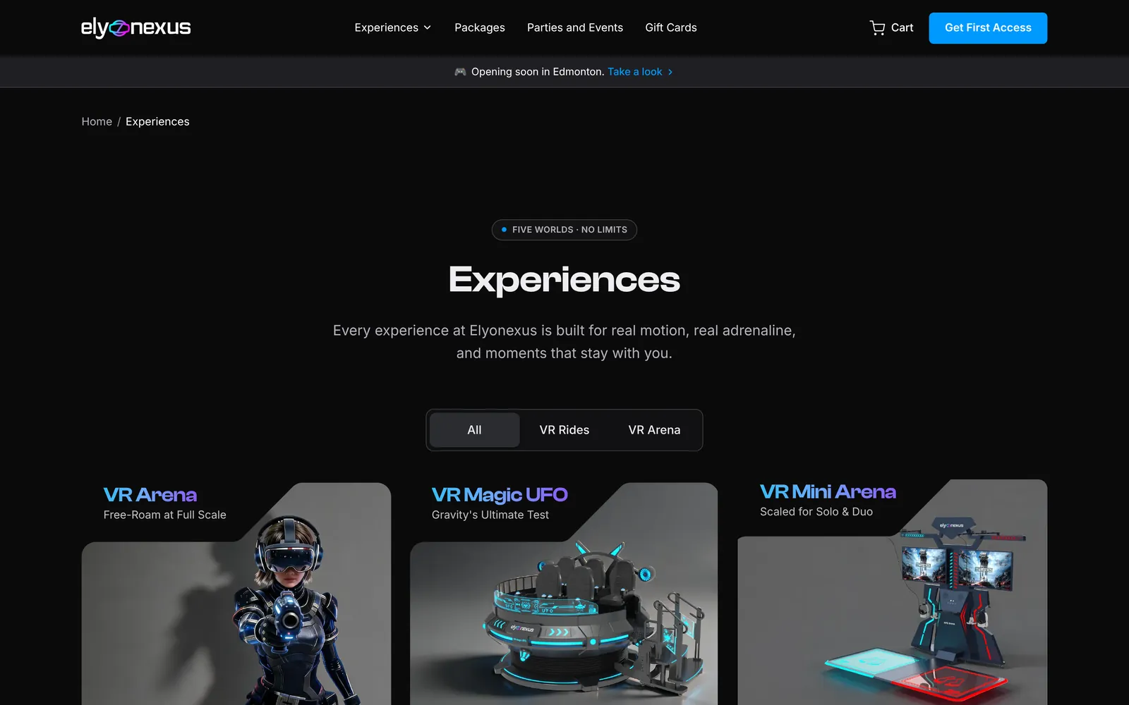
elyonexus.com/experiences
All experiences page
All experiences. Filter rides and arenas in one view.
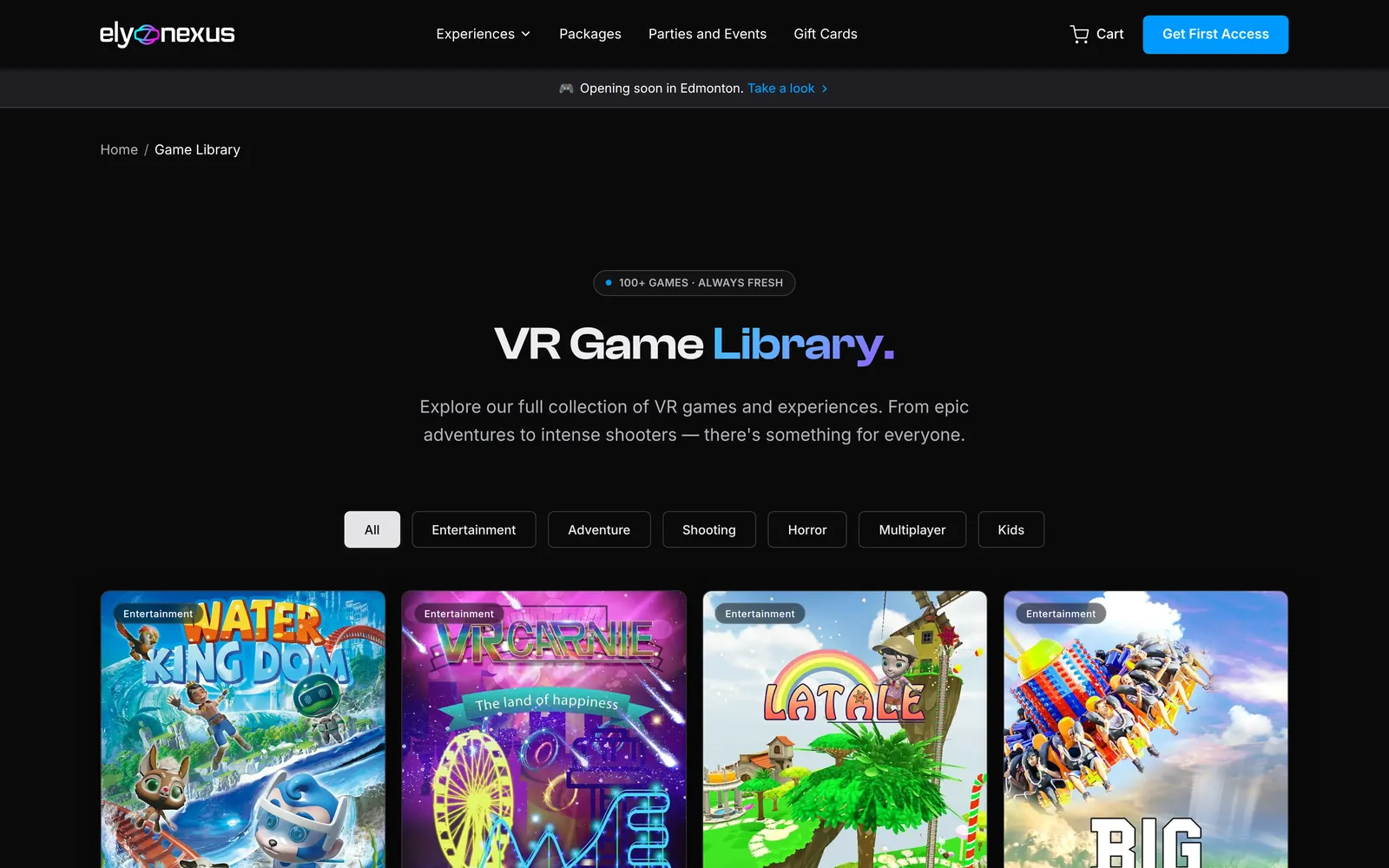
elyonexus.com/games
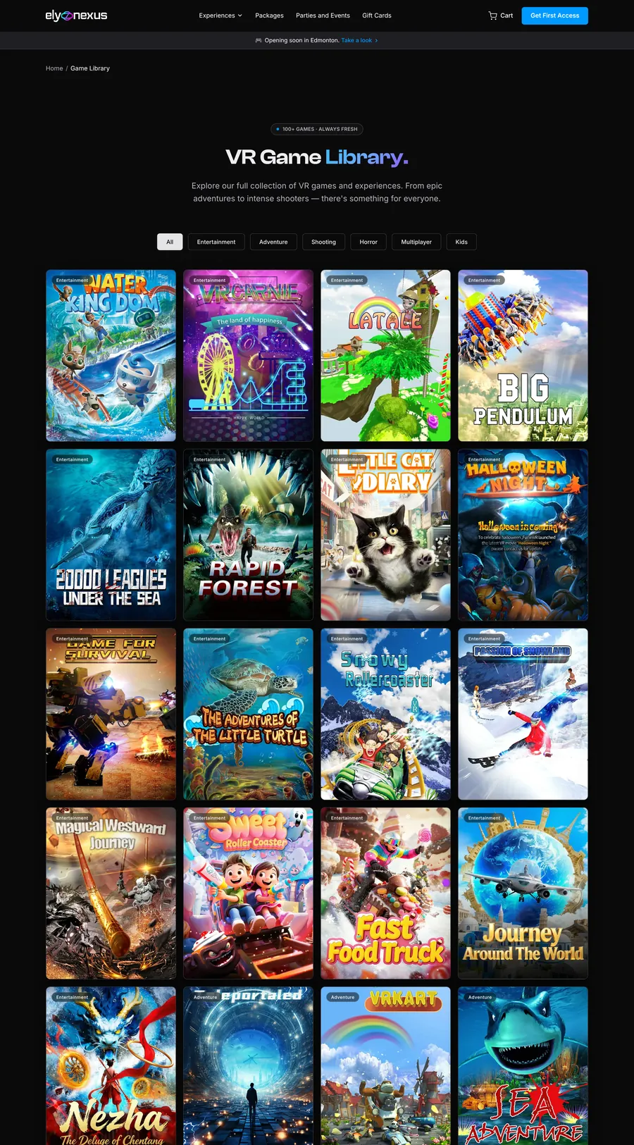
Game library page
Game library. Every world, filterable by mood.
Screens Key moments

Small decisions that move people to book.

The details that do the converting, up close.

Ride product cards
Product cards. A name, a one-line promise and a hero render, so visitors can picture themselves inside.
Four step visit section
Four-step visit. Numbered because it is a real sequence.
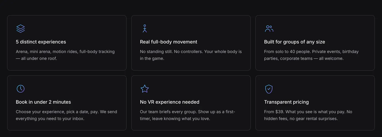
Why Elyonexus section
Why Elyonexus. Six proof points for the comparison every visitor makes.
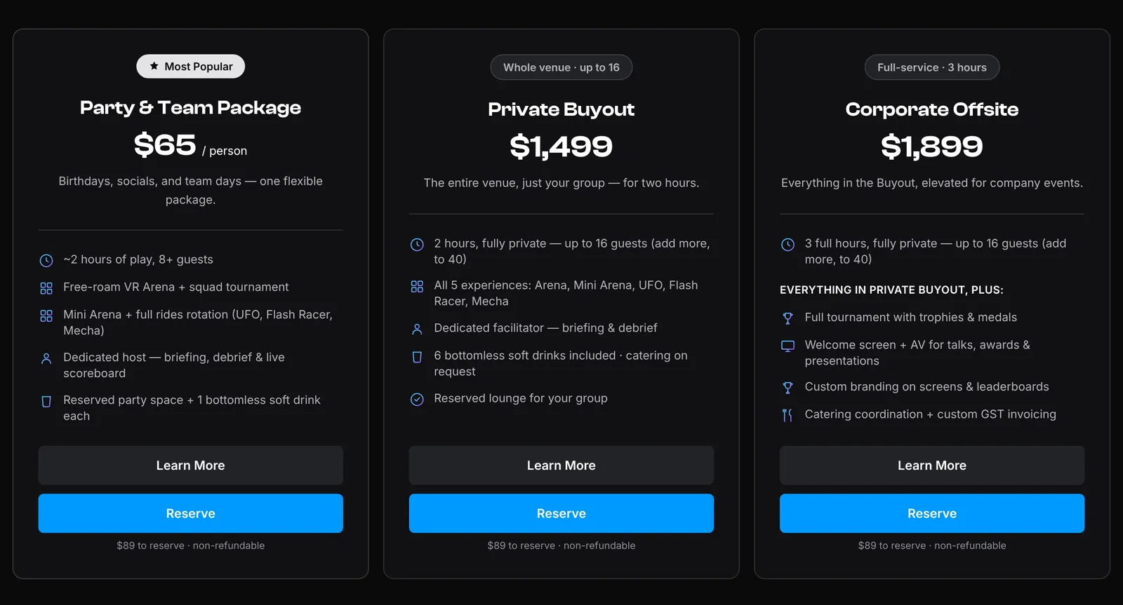
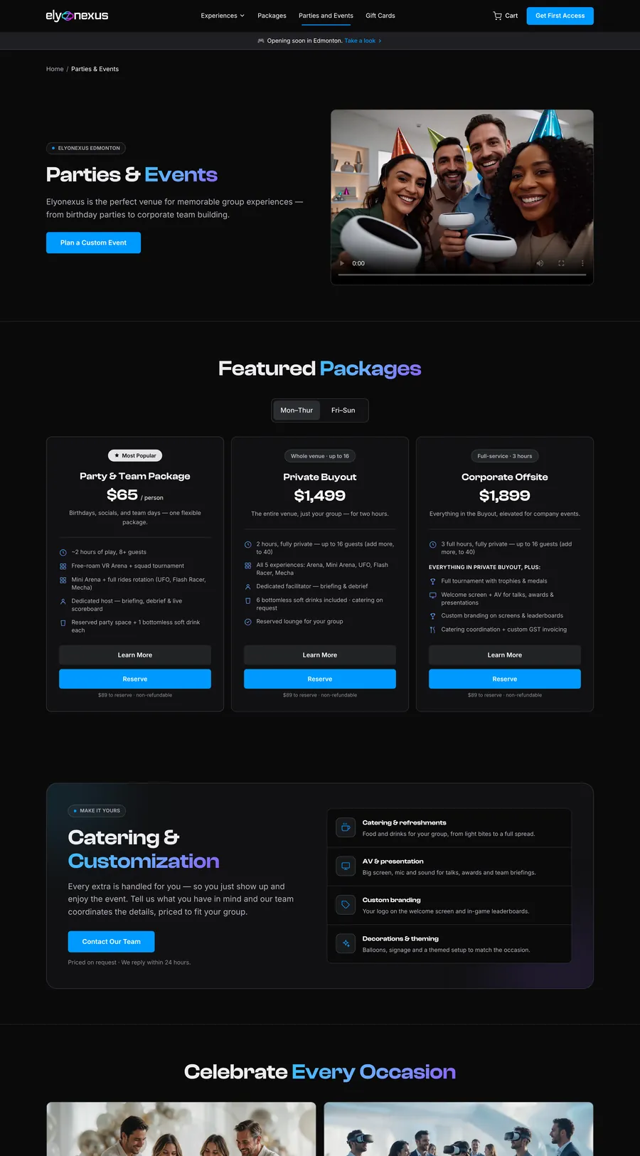
Party, buyout and corporate packages
Group packages. Three tiers, weekday and weekend prices, every inclusion listed and deposit terms under each button.
Screens The full product

Thirteen pages, one system.

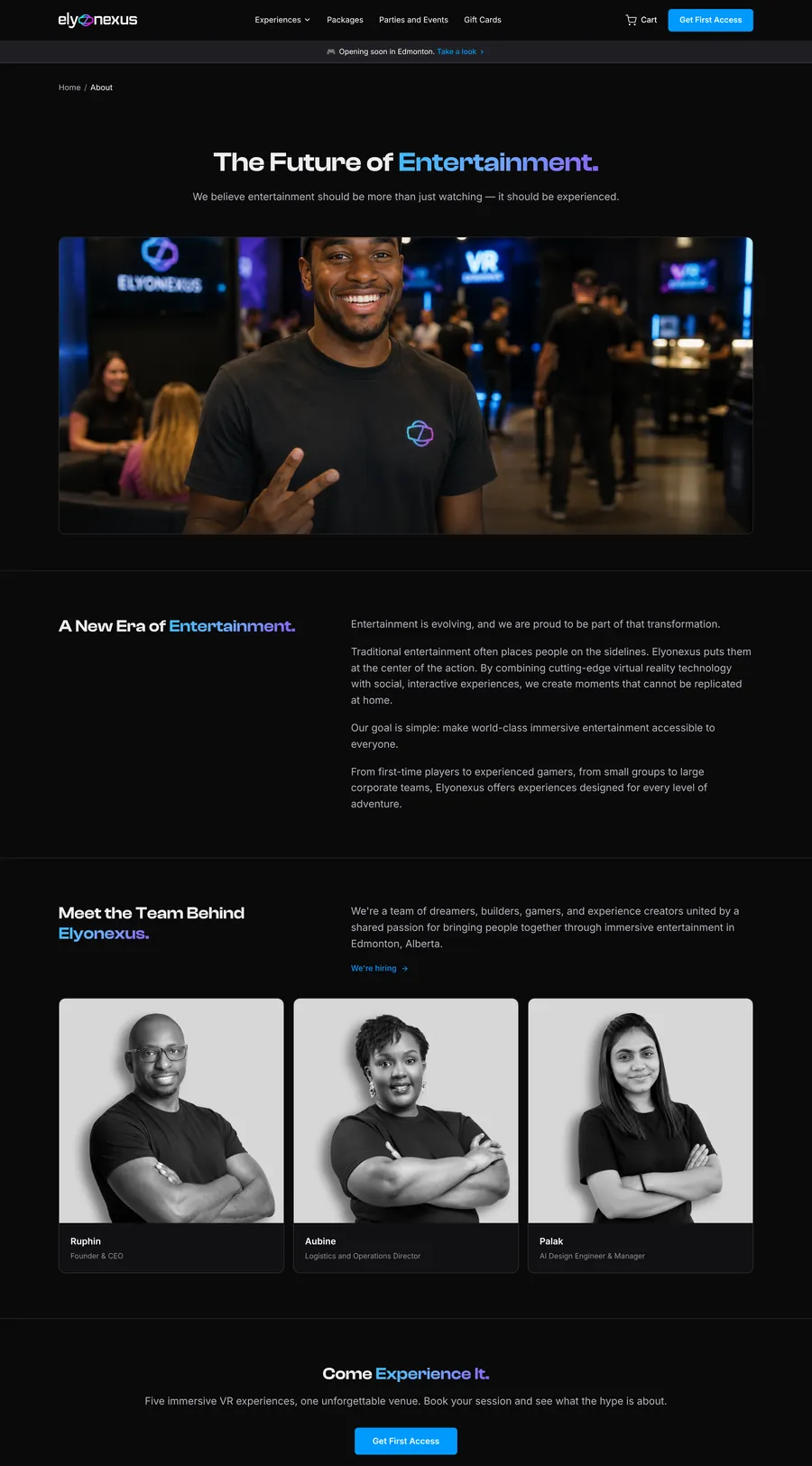
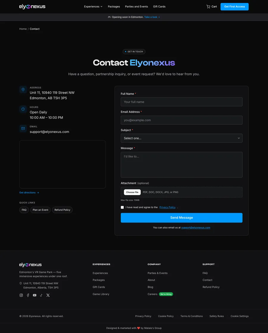
Games, gift cards, events, FAQ, blog, about and contact, all built from the same tokens and components.

Chapter five

Motion & micro-interactions.

Recorded on the live site. Each one has a trigger, a response and a reason to exist.

LIVE SITE

Audience tabs

Trigger
Click Solo, Private or Corporate
Response
Image, copy and CTA crossfade in place
Why
Three offers in one spot, without three long sections
LIVE SITE

Mobile menu

Trigger
Tap the menu icon
Response
Full-screen sheet, experiences expand inline
Why
Big tap targets and the CTA pinned to the thumb zone
LIVE SITE

Nav dropdown & card hovers

Trigger
Hover the nav and ride cards
Response
Menu drops in, cards lift and glow
Why
Instant feedback before the click builds confidence
LIVE SITE

FAQ accordion & filters

Trigger
Open a question, filter by topic
Response
Answer expands smoothly, list re-filters
Why
Safety and pricing answers in one tap, not one call
LIVE SITE

Game library filters

Trigger
Choose Horror, Multiplayer or Kids
Response
Grid reflows to matching worlds
Why
Lets each group find "their" game fast
LIVE SITE

Weekday / weekend pricing

Trigger
Toggle Mon–Thur or Fri–Sun
Response
All three package prices update together
Why
Honest pricing, and a nudge toward quieter weekdays
LIVE SITE

Gift card occasions

Trigger
Filter by Bestie, Love or Entertaining
Response
Designs filter by the moment
Why
People shop for an occasion, not a SKU
LIVE SITE

Join the Fleet

Trigger
Focus and type an email
Response
Field glows blue, button invites the click
Why
One field, zero friction, maximum sign-ups
LIVE SITE

Scroll reveals

Trigger
Scroll down any page
Response
Sections fade and rise 24px into place
Why
Long pages feel paced, not dumped
Principle 01PurposefulMotion explains a change. Nothing moves just to move.
Principle 02Quick200–400ms for UI, so the site never feels slow.
Principle 03EasedExpo-out curves: fast start, soft landing.
Principle 04OptionalFully respects "reduce motion" settings.
Responsive Mobile · 390

Designed for the phone in their pocket.

Most visitors arrive from Instagram and TikTok, so every page was designed mobile-first, with thumb-reach actions and type that reads at arm's length.

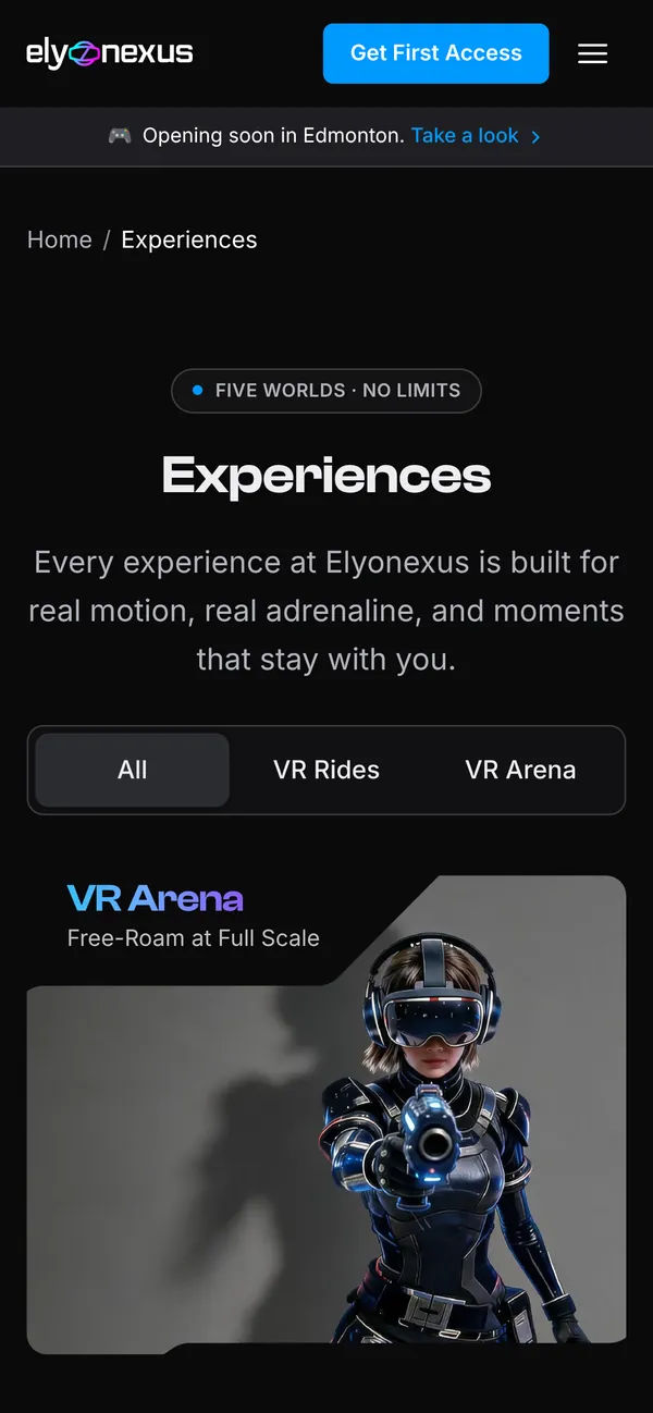
Mobile experiences page
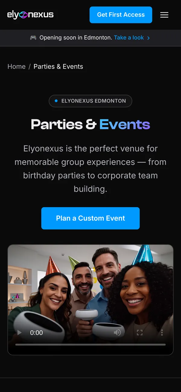
Mobile events page
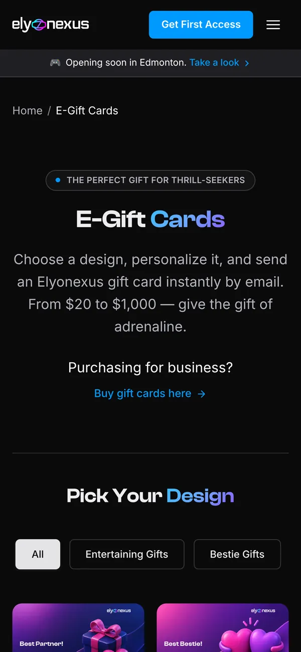
Mobile gift cards page
06 Outcome

Ready to open the doors.

The site is live and taking waitlist sign-ups and gift card orders. Booking switches on at opening with no redesign needed.

Product

Strategy

  • Problem framing & goals
  • MoSCoW scope
  • Two-phase launch plan
UX

Structure

  • 3 proto-personas & journey map
  • 14-page sitemap, 3 core flows
  • Desktop & mobile wireframes
UI & build

Product

  • Design system & components
  • 13 responsive pages, motion
  • Cart, gift cards, Stripe Canada
What we learned
Craft can stand in for proofWith no reviews, precision in type, pricing and copy did the trust-building.
Design the switch, not the redesignPlanning both phases up front means launch day is a toggle, not a project.
Answer doubt where it happensThe FAQ is a backup. The real answers live beside the buttons.

More work from the studio

A few other projects we've designed and built.

Explore more works

Got an idea?

Let’s build something worth noticing

Let’s talk