
Print-on-demand,made trustworthy.
Lailyo is a contemporary clothing brand rooted in creativity, comfort and individuality. We redesigned its Shopify store so mobile shoppers trust it enough to pay upfront, from home page to checkout.
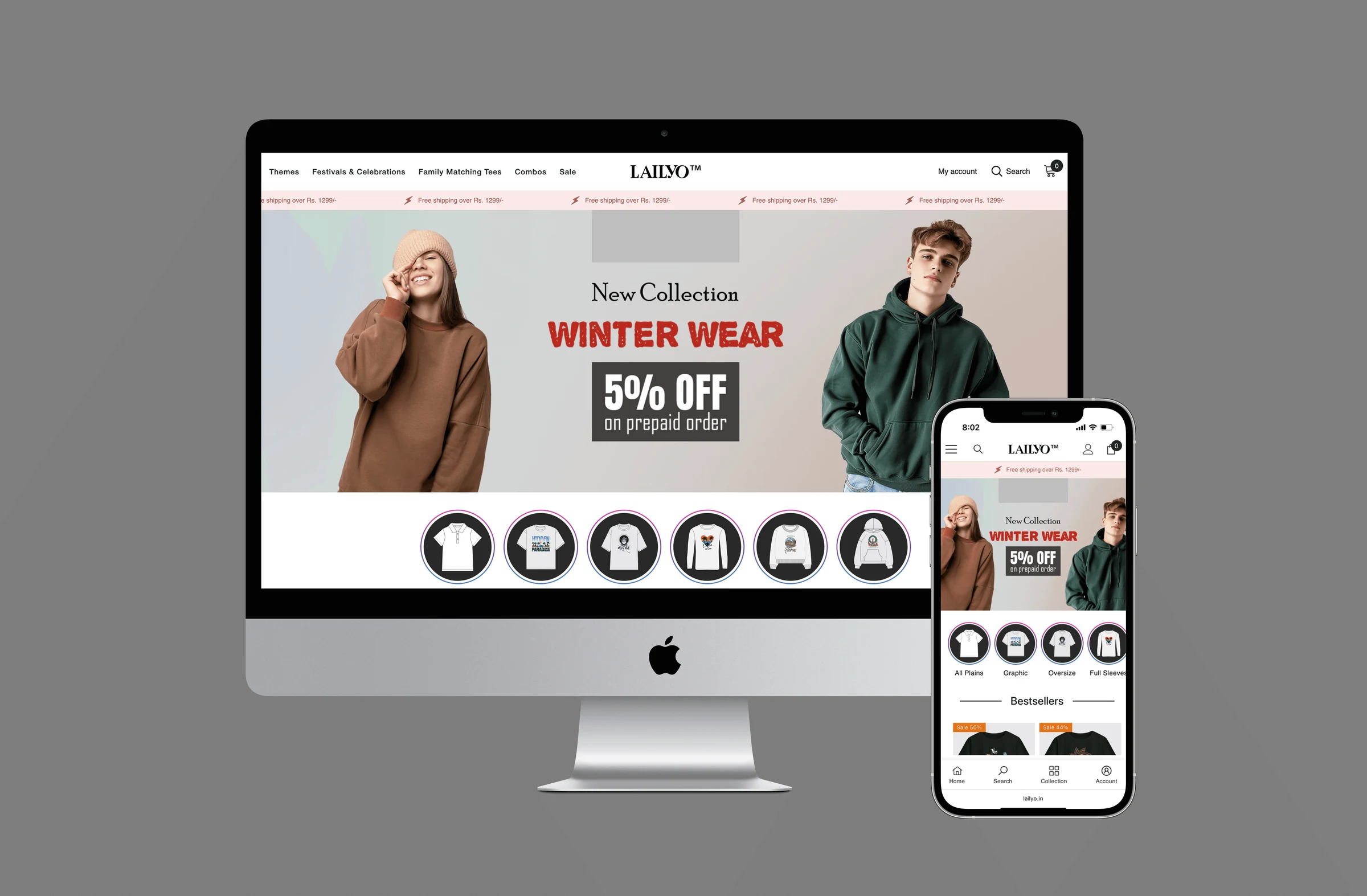
A brand experience that feels personal and trustworthy.
Lailyo blends oversized and unisex t-shirts, hoodies and sweatshirts with storytelling inspired by culture and celebrations, for shoppers aged 16 to 55. The goal was never just to sell apparel.
COD by default
Shoppers chose cash on delivery for a new brand, a sign of low credibility before payment.
85% on phones
Most traffic was mobile, but the interface was neither smooth nor responsive.
73% carts lost
Tied to confusing payment options and policy wording at checkout.
How do we make Lailyo’s online shopping experience authentic, consistent and trustworthy enough for customers to pay upfront?
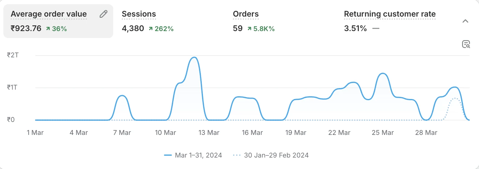
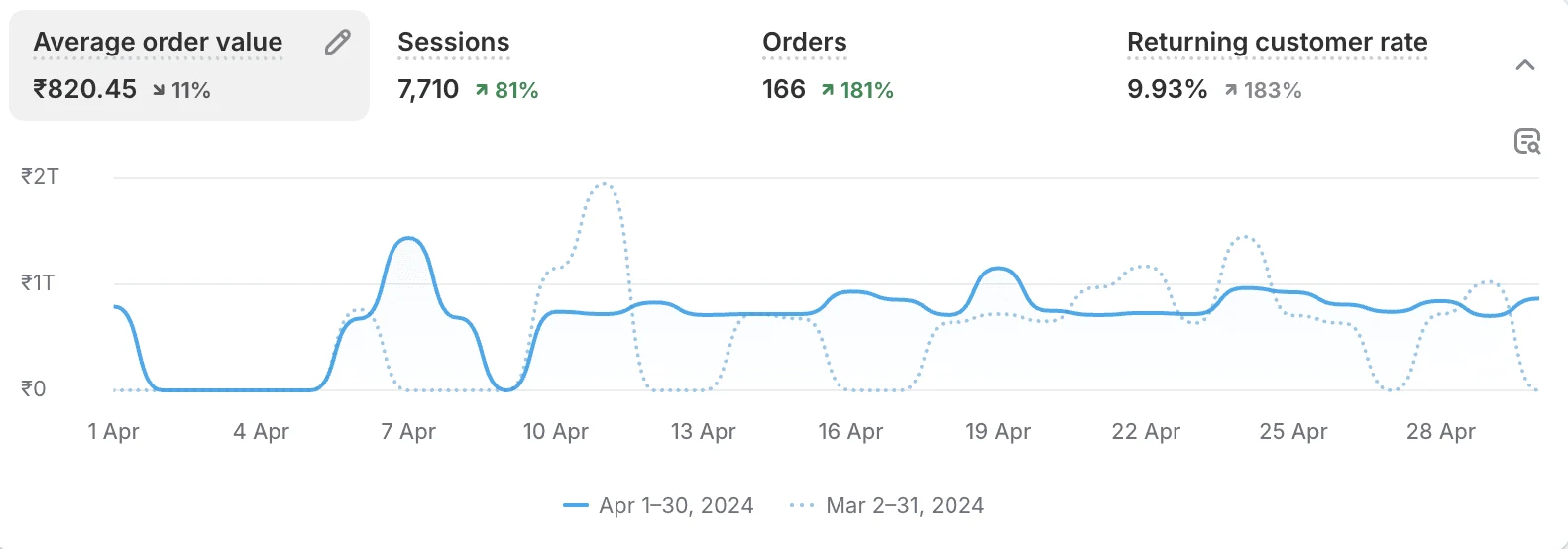
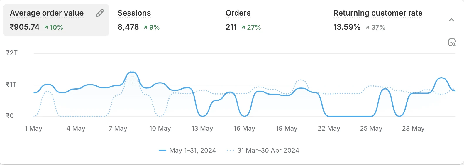
The redesign delivered immediate impact.
In a crowded marketplace full of endless options, curated collections, easy product discovery and a clean checkout made Lailyo stand out with online shoppers.
Built for mobile-first shoppers in Tier 1 to 3 cities.
Lailyo tackles the industry’s biggest problems: trust, dependence on cash on delivery and inconsistent brand experiences.
Premium design flexibility
- A premium theme gives an authentic, standout look before anyone buys.
- Smooth navigation and professional presentation across every touchpoint.
- Fast on low connectivity and fully responsive on any device.
Streamlined checkout
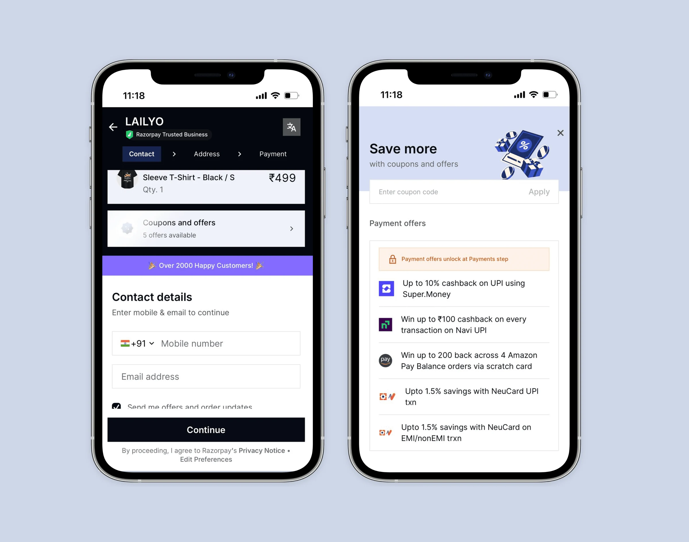
- A third-party checkout replaces the generic theme checkout for reliability and trust.
- Flexible payment options for every kind of shopper.
- Designed to reduce checkout abandonment.
Product confidence
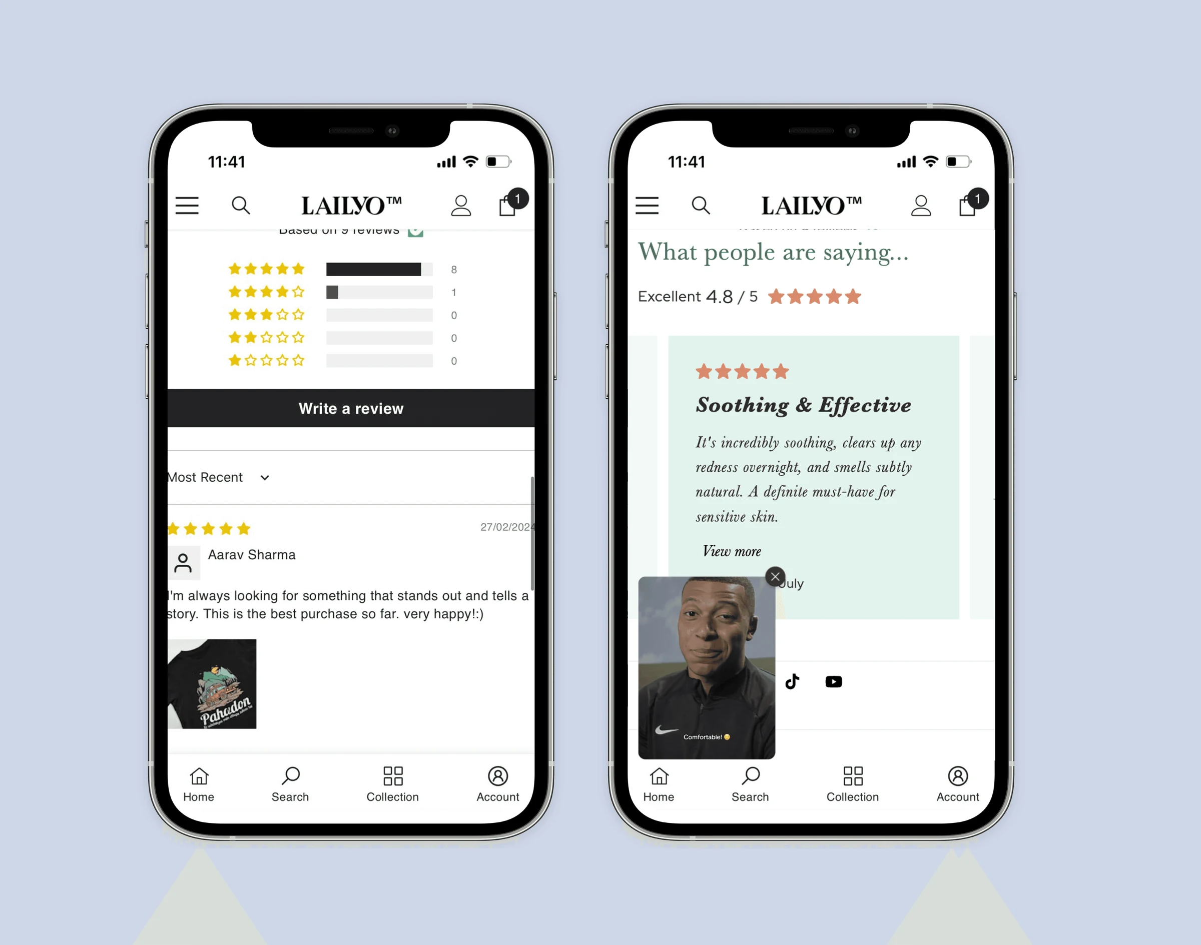
- Reviews and product videos on every product page.
- Visual demonstrations help shoppers decide before buying.
- Social proof builds confidence in the product and the seller.
Empathize.
Understanding the fashion ecommerce market and the people shopping in it.
Print-on-demand in India has grown fast since 2020.
Growth is driven by digital-first shoppers who want premium experiences. Generic marketplaces create decision fatigue, which opens room for curated stores like Lailyo.
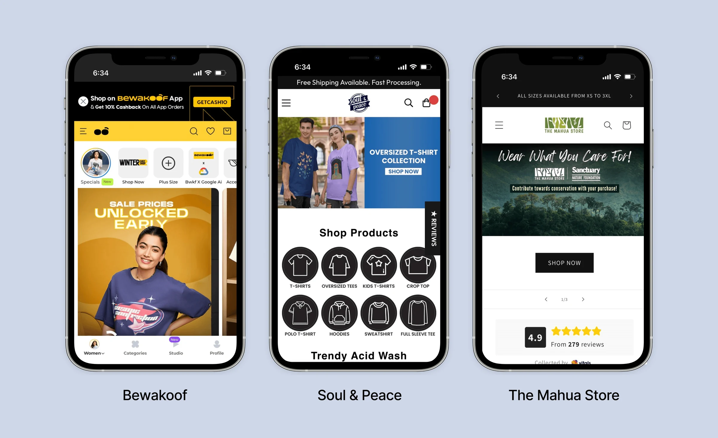
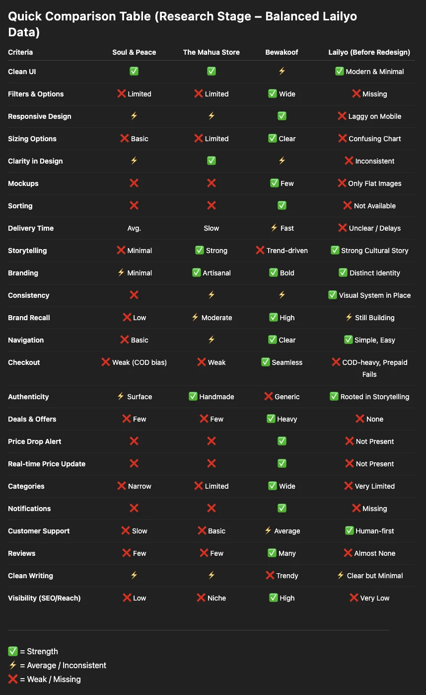
Three popular fashion stores, and where they fall short.
Before jumping into solutions, we looked at direct and indirect competitors to see how they speak to their audience.
How people really shop online.
We spoke to 3 regular online fashion shoppers aged 16 to 55, all using two or more apps such as Bewakoof, Soul & Peace and Myntra. Two shared their screens; one was an open-ended interview.
Checkout needs credibility
Poor payment visibility and weak security signals make shoppers hesitate.
“I always choose COD because these checkout pages look sketchy and unsafe. I don’t trust them with my card details. Also I cannot see UPI payment options upfront.”
Shoppers want social proof
Reviews drive 72% of Indian purchases; without them, trust breaks immediately.
“I like the t-shirt design but can’t see any reviews. Can I really trust this platform? I doubt whether I will get the exact product, on time.”
Hidden discounts frustrate
Missing coupon placement and unclear bulk pricing reduce motivation to buy.
“Where do I apply discount codes? What discount will I get if I buy more than two t-shirts?”
Mobile has to just work
Loading problems on phones mean instant frustration and lost traffic.
“This is so frustrating! The website is not opening on my phone. I usually shop in my free time, and mobile is more convenient than any other device.”
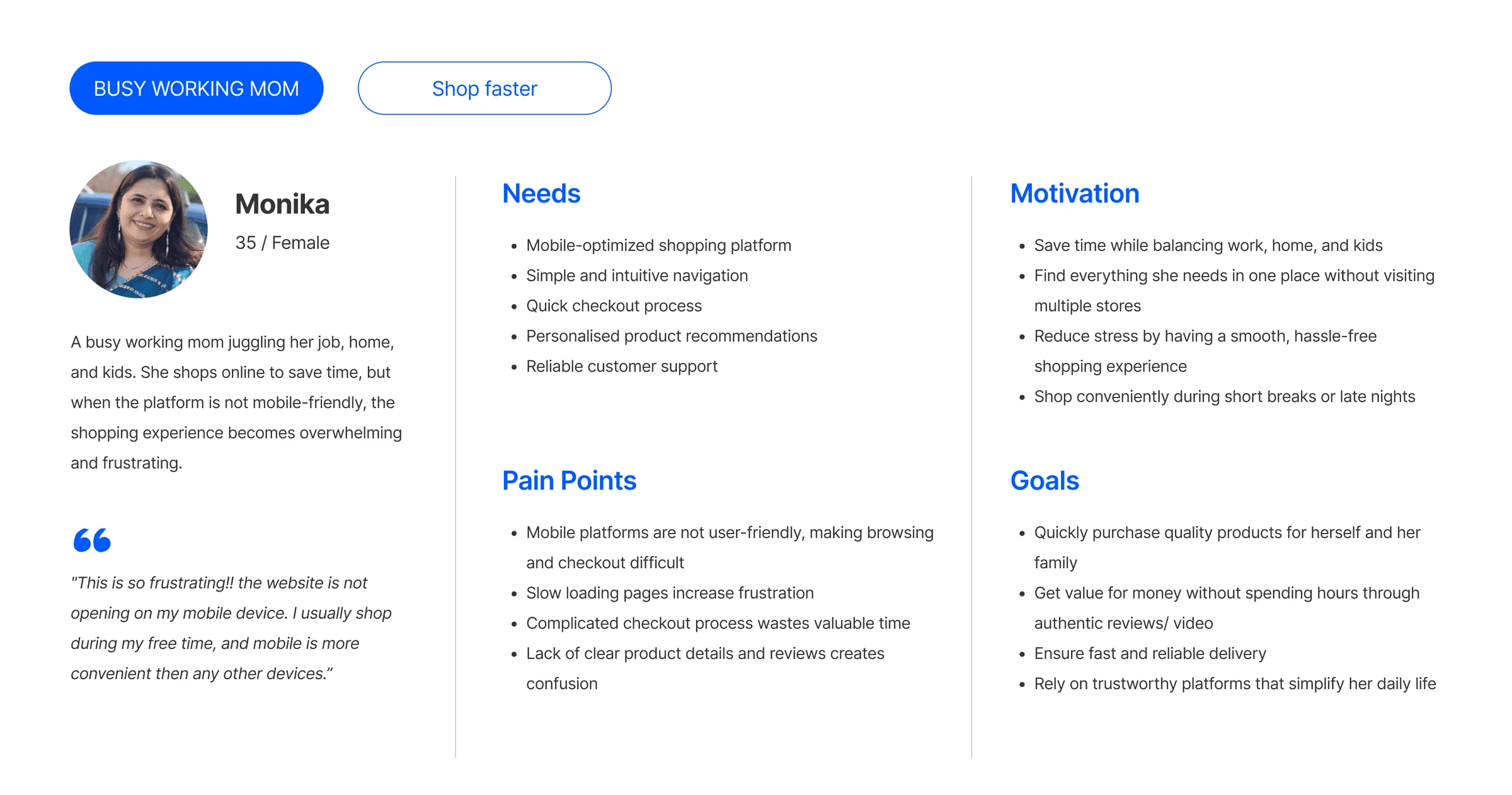
Meet Monika.
A persona to keep the real people, and the real problems they face, in front of every decision.
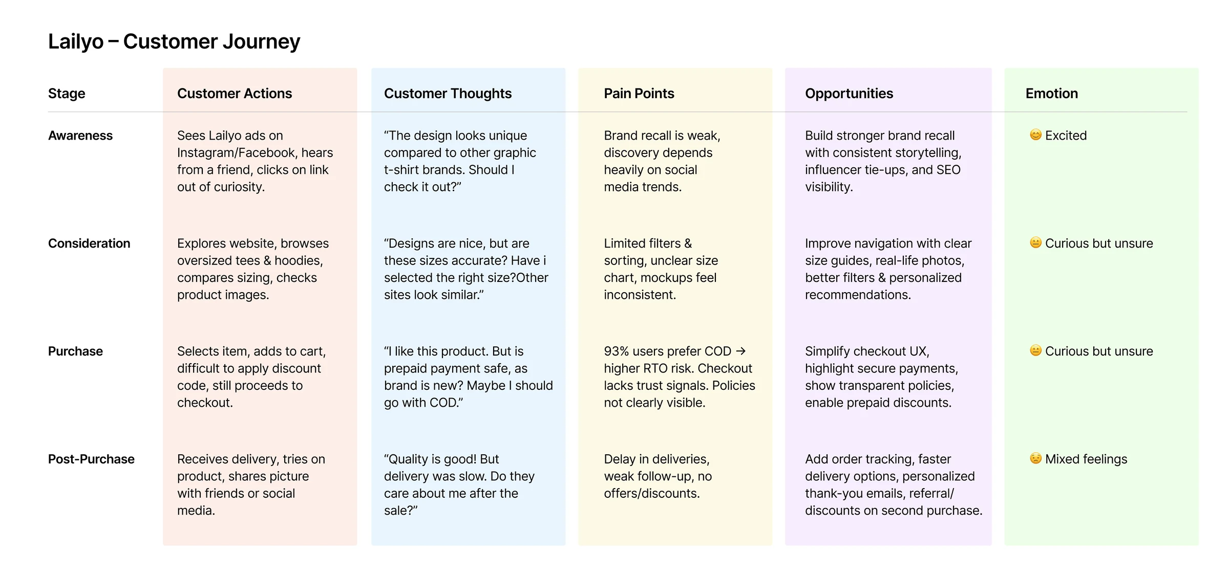
Friction at almost every step, from search to checkout.
Sizing doubts, trust, small-screen navigation and checkout turned a simple purchase into a frustrating one.
Define.
Deciding which problem to solve first.
Improve retention
Increase repeat visits by keeping customers coming back.
Grow new visits
Bring more first-time shoppers to the store.
Convert on mobile
Higher click-through on the mobile-first site, all the way to purchase.
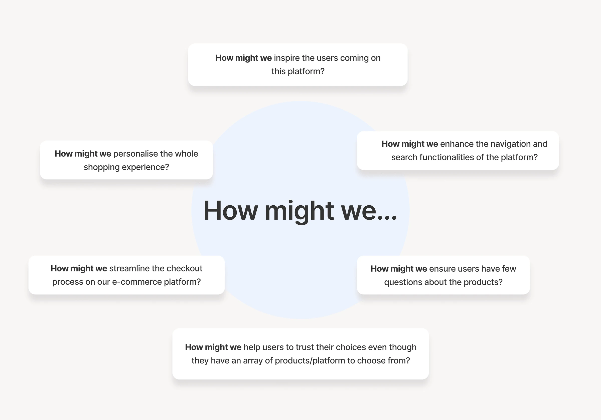
All research pointed to a few key questions.
The main problem was reframed from the shopper’s point of view into “How might we” questions to guide the redesign.
Ideate.
Exploring as many ideas as possible, quickly.
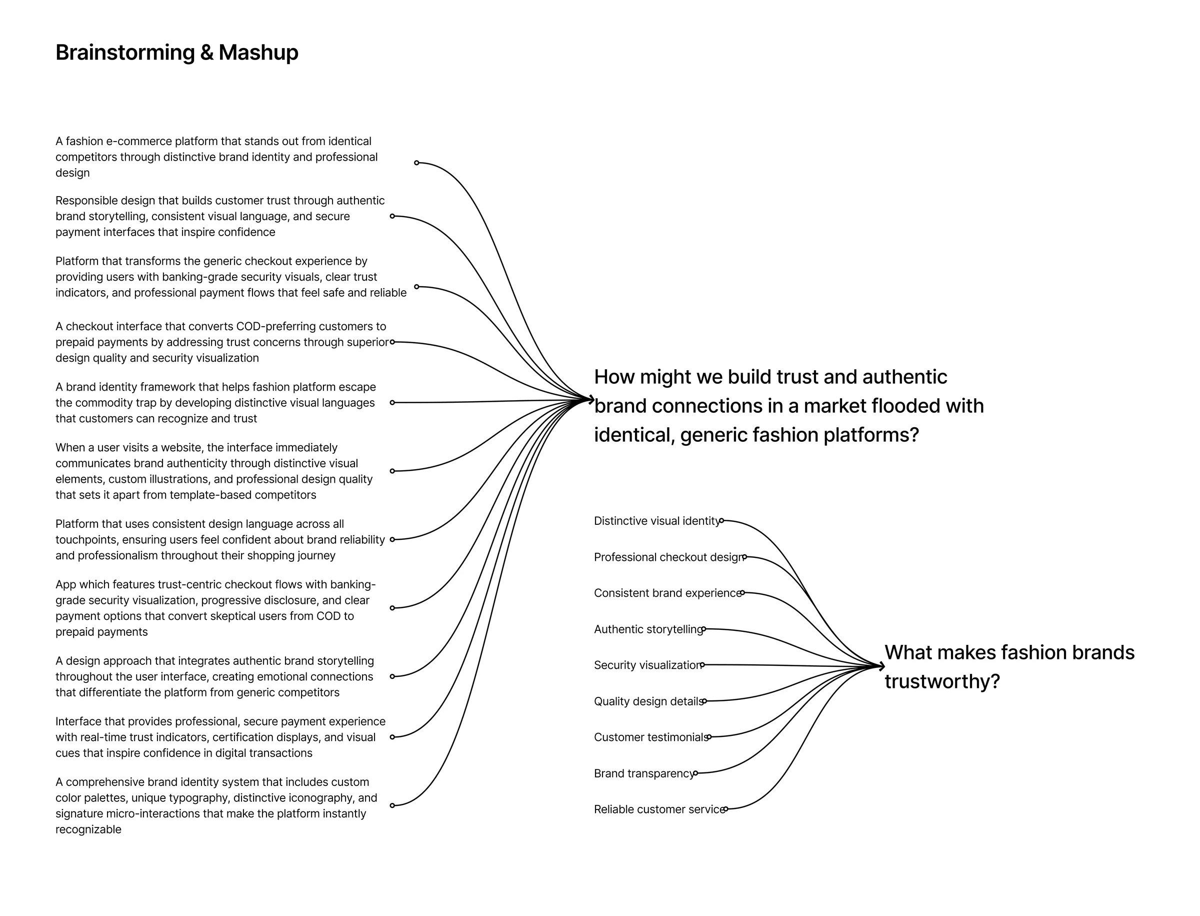
Rapid idea sprints, no judgement.
With user insights and How Might We questions in hand, we ran 2 to 3 minute sprints for each challenge, aiming for quantity before quality.
Design.
Turning ideas into real screens.
Ella: elegant, minimal and trustworthy.
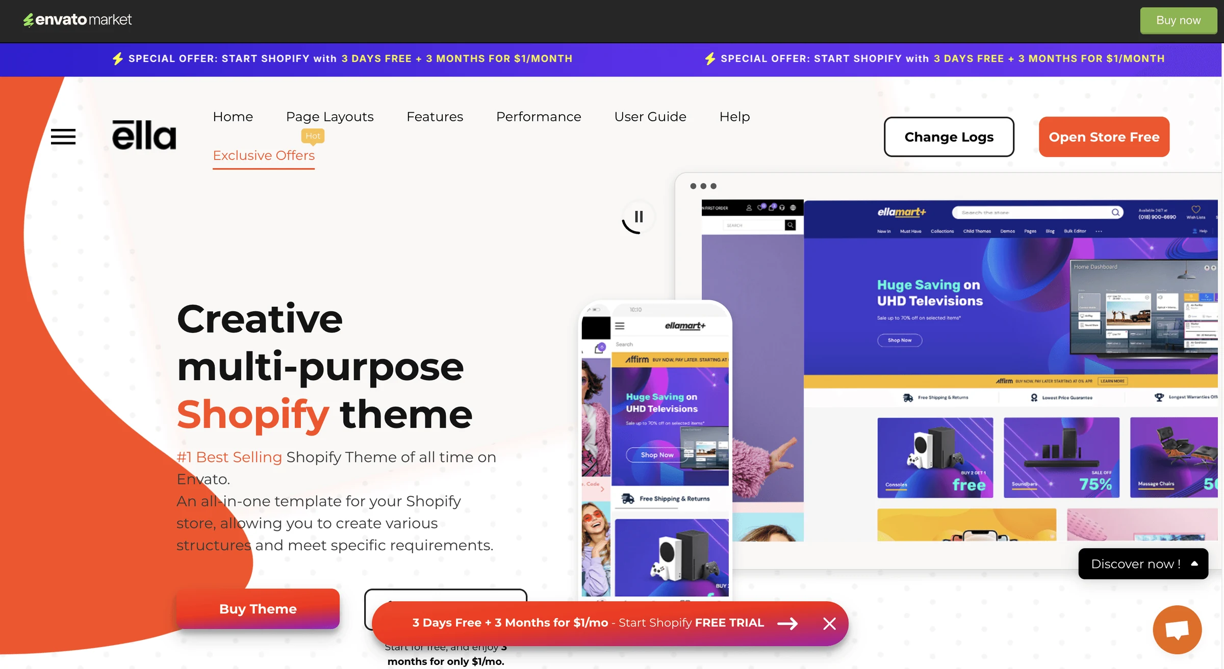
After thorough research we chose the paid Shopify theme Ella. It offers optimised code, fast performance, deep customisation and a feature-rich mobile experience, and we amended it into a modern, creative store.
Tight deadlines, so we focused on what mattered.
A lean approach: build the minimum viable product first, launch the most important features and save the rest for later versions.
Theme limitations
Some customisations needed workarounds because of built-in layout restrictions.
Performance
Balancing rich visuals and smooth animation with fast loads on desktop and mobile.
Responsiveness
Every feature and customisation had to work across all screen sizes.
Integrations
Limited flexibility in some plugins meant choosing apps carefully to avoid conflicts.
Bringing the experience to life.
Familiar patterns, clear information and fewer steps, so shoppers spend their energy choosing, not figuring things out.
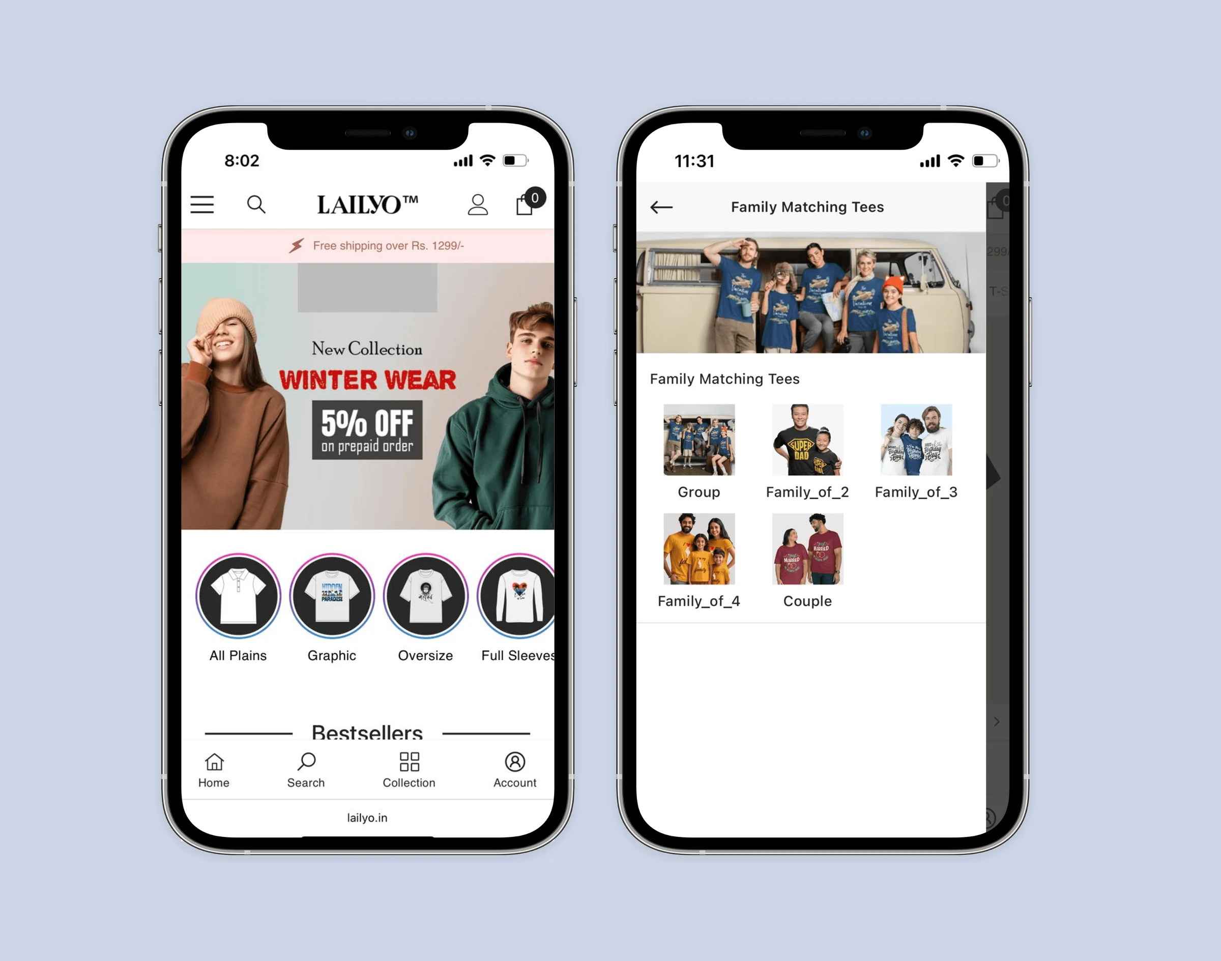
App-like mobile experience
- Bottom navigation feels like a familiar app.
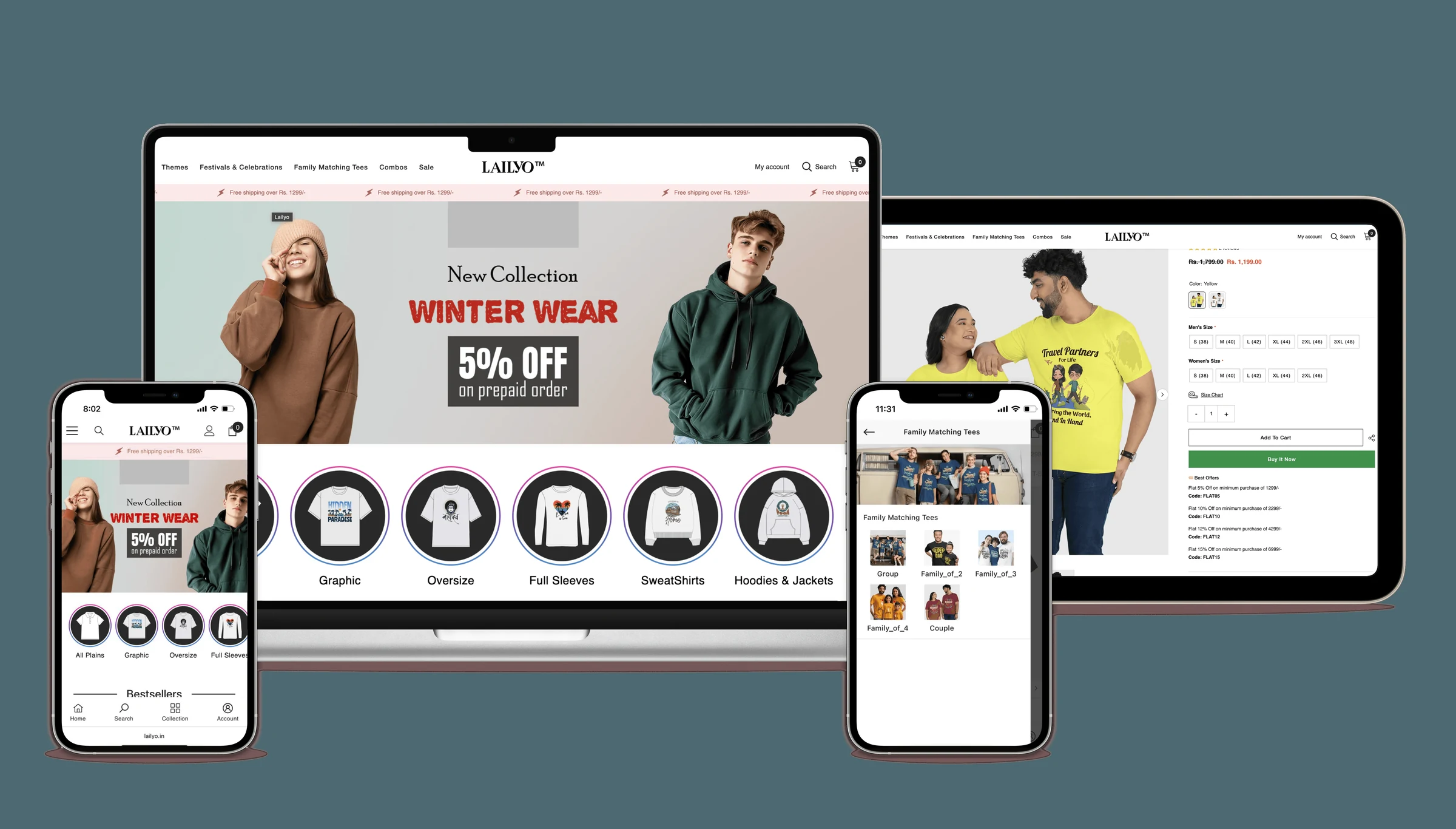
- Visual categories make browsing intuitive.
- A marquee banner and graphic banners keep offers always visible.
Smart shopping assistance
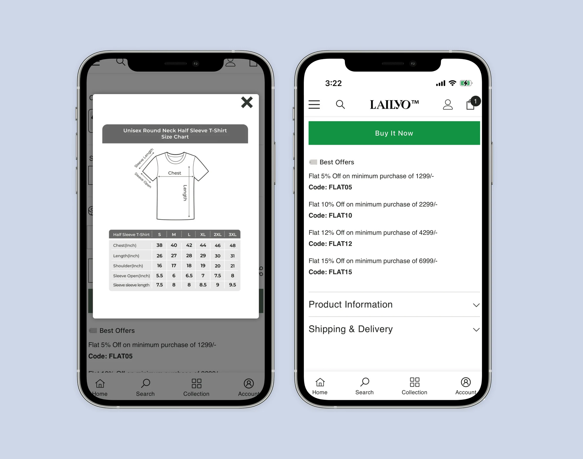
- A visual size chart helps shoppers pick the right fit.
- All store offers shown under Buy now, upfront.
Frictionless checkout
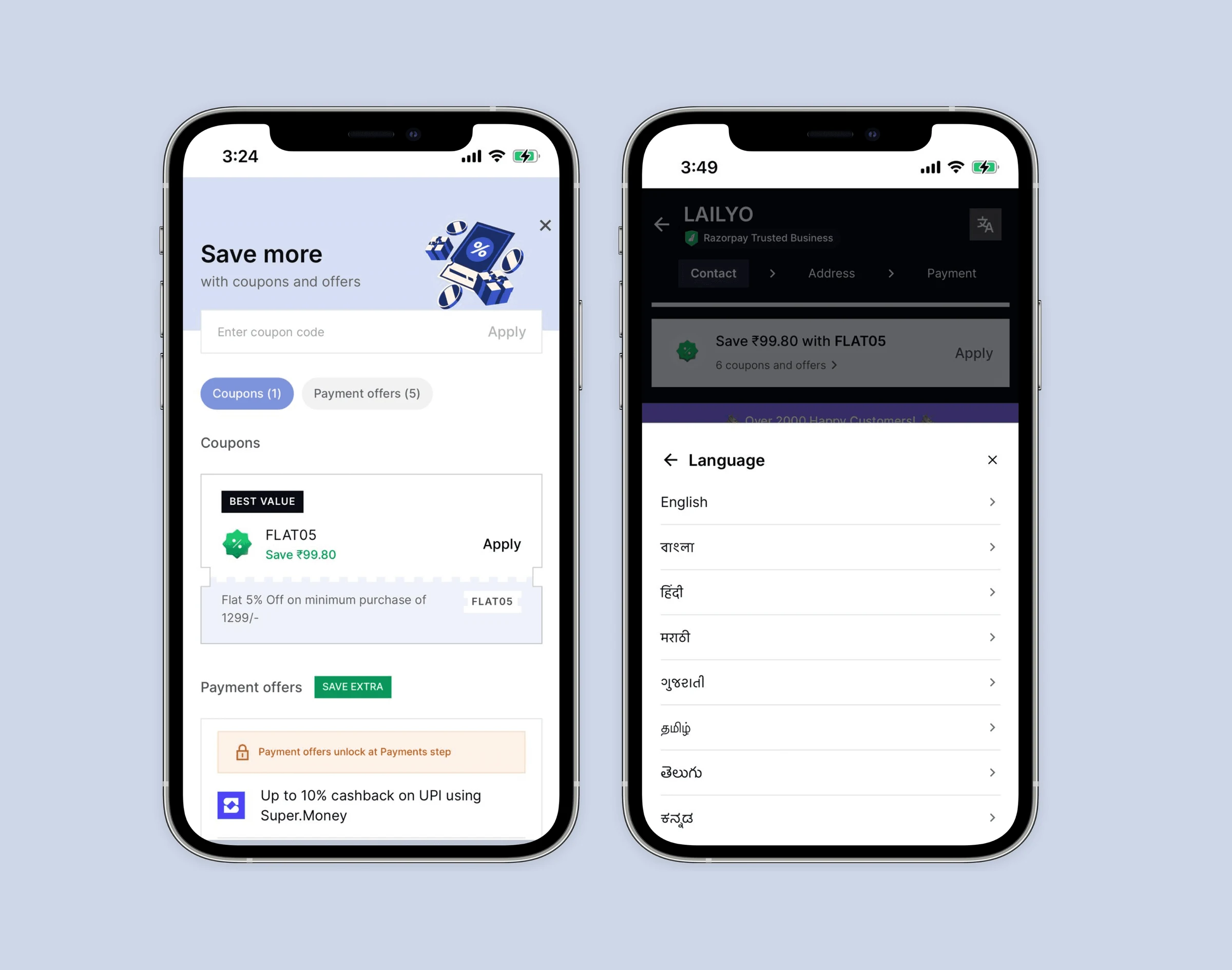
- Optimised payment gateway built for conversion.
- Coupons applied automatically.
- Major languages supported.
- Fewer steps to pay.
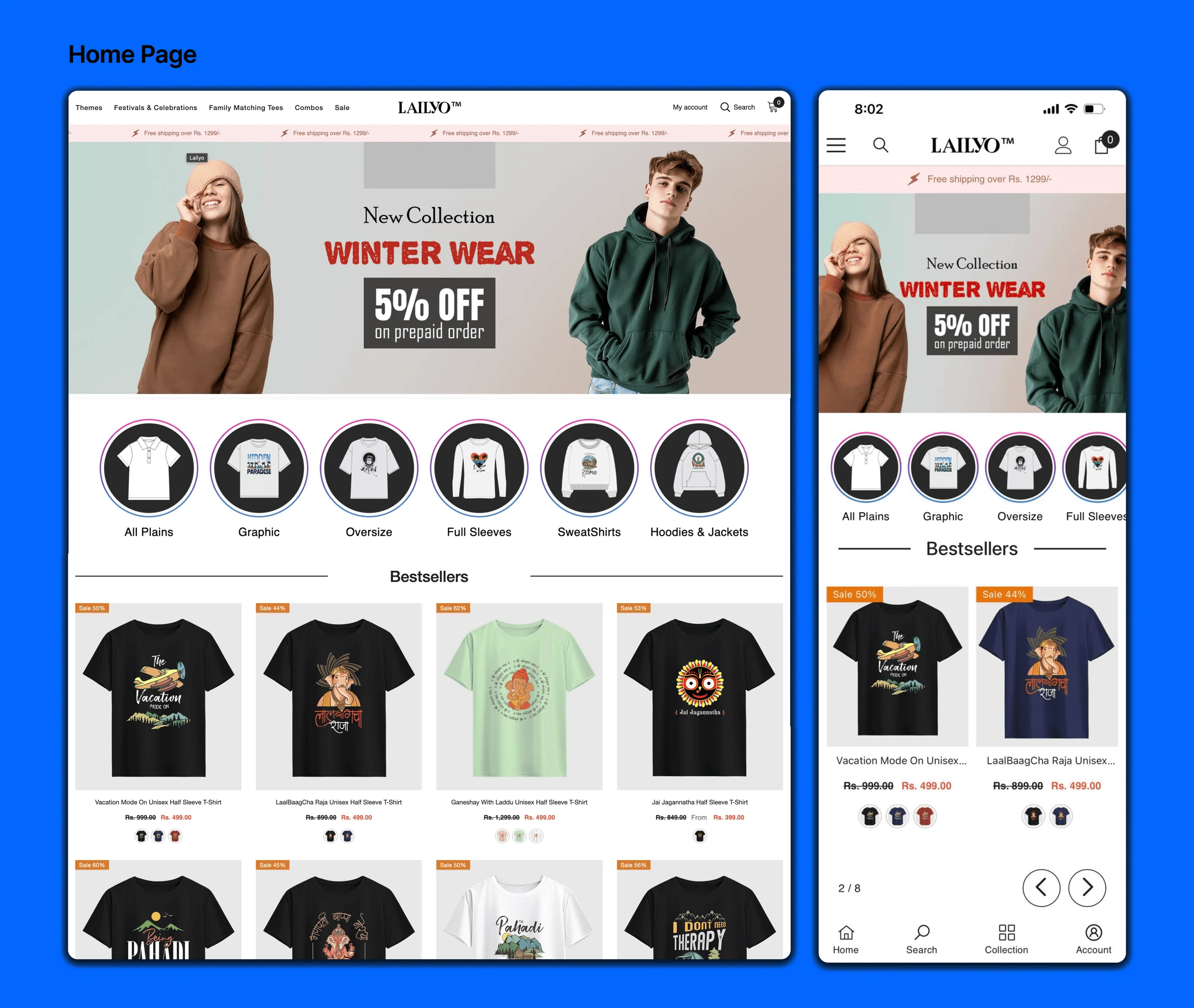
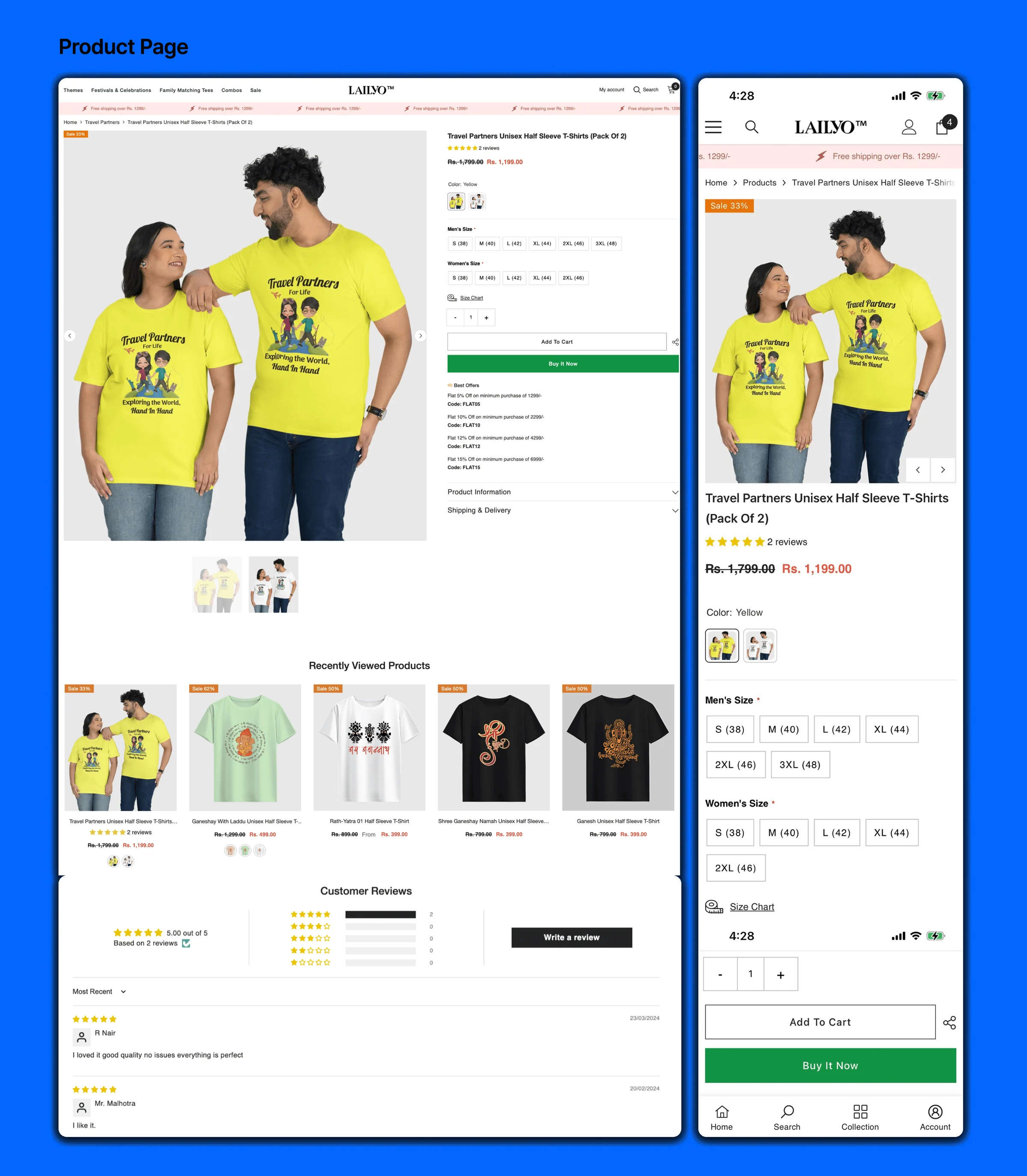
One store, every screen.
Designed and tested across desktop, tablet and phone.
Trust turned into prepaid orders.
By building customer trust and stronger connections, engagement and satisfaction went up.