
Case studyProduct strategy · UX · UI · Build

Jirehnexus.Government-grade security,priced for main street.

A cybersecurity consultant with 15 years in the Canadian Army, government and police wanted to serve small businesses the way he served ministries. We researched the market, designed the product ladder, and built the website, free assessment, customer portal and review console that make one expert scale.

Market researchProduct strategyUX & information architectureDesign system24-page buildPortal & console
jirehnexus.com
Client
Jirehnexus
Founder
Ruphin Matala, CISA · CISSP · PCIP · PMP
Location
Edmonton, Alberta
Industry
Cybersecurity, compliance
Scope
Strategy to working prototype
00 Overview

One expert. Hundreds of clinics, law firms and shops.

Manual security assessments cost $15K to $25K and take weeks. Compliance software costs $7.5K a year and comes with no human. Canadian SMBs got neither. Jirehnexus had to be the third option: an automated assessment, a named expert's signature, and a price three to six times lower.

Challenge

Trust at a low price

A buyer who pays less expects less. The product had to feel more rigorous than a $20K consultant while costing a fraction, without a single fabricated testimonial or unsourced statistic.

Approach

Automate everything but judgement

Reduce 153 safeguards to the 30 that need Ruphin. A free 12-question assessment as the front door, automation for scoring and drafting, and a human approval that is a stored fact, not a convention.

Outcome

Four surfaces, one system

A 24-page marketing site, six free tools, a customer portal and a review console, on one design system, with every open commercial decision logged for the founder.

0Pages designed and built
0Questions in the free assessment
0Safeguards scored in a paid analysis
0Design directions explored before "Option O"
01 Process

Research first, then the product, then the pixels.

A founder meeting, live market research, a strategy document as the single source of truth, then design and build in milestones with a self-review after each one.

01

Discover

Founder meeting and research.

  • Positioning
  • Market and threat data
  • Competitor pricing
02

Define

The product, in writing.

  • Service ladder
  • 12 product decisions
  • Personas and triggers
03

Structure

Four surfaces, one map.

  • Free funnel flow
  • Site, portal, console IA
  • Journey map
04

Explore

Find the look.

  • 16 directions
  • Option O chosen
  • Design system tokens
05

Build

No framework, no build step.

  • 24 static pages
  • Portal and console
  • Six free tools
06

Audit

Prove it before trusting it.

  • Six-lens launch audit
  • Contrast, overflow, links
  • Open decisions logged
Chapter one

Product strategy.

Why now, who pays, what they pay for, and the twelve decisions that turned a consultant's hours into a product.

Market researchCompetitive gapService ladderProduct decisionsAutomation principle
Problem statement

Canadian small businesses are attacked like enterprises and insured like enterprises, but the only security help on offer is priced for enterprises.

43%of Canadian organisations were targeted by a cyberattack in the last 12 monthsCIRA 2025
96%of cyber insurers now mandate enforced MFA; optional MFA fails underwritingInsurableIT 2026
25%+yearly growth in compliance automation, the fastest slice of the GRC marketTrendX Insights
$25Mmaximum fine under Canada's incoming CPPA, with no small-business exemptionBill C-27

Every figure on the client's site carries a citation the founder approved. Unsourced breach-cost numbers on the old site were removed. On a site selling trustworthiness, a wrong number costs more than a missing one.

Research Competitive gap

Nobody served the 10 to 500 employee business.

We mapped every option a Canadian SMB has today. Each one is built for someone else.

OptionBuilt forPriceWhat is missing
Vanta, Drata, SecureframeFunded startups chasing SOC 2$7.5K to $20K+ per year, sales call requiredNo human expert, no PCI or PIPEDA focus
vCISO platformsMSPs, not end clients$15K to $20K platform plus $150 to $300 per hourSold to the middleman
Manual consultantsEnterprises$15K to $25K for a 50-person firmWeeks of interviews, no monitoring, no benchmark
Alberta IT shopsManaged IT customersQuote onlyNo self-serve assessment, security as an add-on
JirehnexusCanadian SMBs, 10 to 500 staffFree to $4,750, size-based, publishedAutomated assessment, a named expert's signature, Canadian compliance built in
Product Service ladder

Free in, expert out.

Four tiers, each more human than the last. The free assessment is 100% automated so it can run at any volume; the expert tier is deliberately scarce. Bars show the automation share.

Free

Free assessment

$0

Twelve plain-English questions, a score on screen, the top gaps, no sign-up to begin.

Automation 100%
One-time

Posture Analysis

$2,450 under 25 staff

Full framework assessment, 153 safeguards, MITRE-referenced recommendations, a practitioner's signature.

Automation 95%
Subscription

Always Audit-Ready

$450 per month

Gap tracker, document monitoring, periodic re-assessment and a monthly health report.

Automation 99%
Expert

Expert advisory

Prepaid hours

A to Z remediation with Ruphin, tracked in 15-minute chunks, balance visible in the portal.

Human-led by design

Prices shown are the proposed size-based model, logged as pending the founder's approval. No dollar figure appears without the size tier it applies to.

Decisions From the founder meeting

Twelve decisions, written down once.

Every build milestone referenced the same strategy document, so no decision was re-argued in a chat thread. Six of the twelve that shaped the design most:

01

Never say "GRC" to a customer

Internally it is GRC automation. Publicly it is Cybersecurity Posture Analysis.

A clinic manager has never heard of GRC. "Posture" she can picture.
02

Free report arrives in 2 to 4 hours

A deliberate delay window on the automated free report.

An instant PDF reads as a robot. A two-hour wait reads as an expert.
03

Benchmark by industry

"Schools average 7 of 10. You scored 5." Anonymised, minimum-N aggregates.

Comparison is the strongest sales line and a data moat nobody local has.
04

Explain gaps with MITRE ATT&CK

Each recommendation maps to attacker techniques: recon, access, persistence, exfiltration.

"Why it matters" beats "do this" for a buyer who is not an engineer.
05

Expert time in 15-minute chunks

First 10 minutes free for scoping; paid time auto-deducted from prepaid packages.

Protects the founder's two hours a day and makes the balance visible to the customer.
06

Free tools as the SEO front door

Six small checkers (DMARC, domain hygiene, PCI scope, insurance readiness) that each funnel into the assessment.

A tool that does not compute must not promise an outcome. Three became honest self-checks.
153 → 30
The automation principle

Automation's job is to reduce 153 safeguards to the 30 that need Ruphin. Not to replace his judgement, but to remove everything that is not judgement. The scoring core makes no external calls, LLM drafting only rewrites his notes and can be switched off, and every approval is stored with who, what version and when.

Chapter two

UX design.

Who the buyer is, what makes them act today, the free funnel that is the whole growth engine, and why the assessment has exactly twelve questions.

Personas and triggersFree funnelJourney mapInformation architectureThe twelve questions
🏥

The clinic director

Patient data, PIPEDA, no IT team
Is patient data safe, and can I prove it to the college?
Trigger
A breach at a clinic in her industry, a privacy question from a patient
Fear
Looking negligent in front of regulators
Design answer: healthcare page, PIPEDA self-check, plain-English score
💳

The retail owner

Takes card payments, PCI DSS 4.0.1
My processor keeps emailing me about PCI. What do I actually have to do?
Trigger
A PCI enforcement notice from the acquirer
Fear
Fines, or losing card processing
Design answer: PCI scope finder, retail page, PCIP badge on every report
📊

The CFO

200 staff, renewing cyber insurance
The questionnaire asks for twelve controls. Which ones do we fail?
Trigger
Insurance renewal, a client security questionnaire
Fear
A board-level surprise
Design answer: insurance readiness check, board-ready report, named signature
UX The free funnel

Seven steps from visitor to call.

The growth engine. Green labels are automated. The one orange step is the only human touch, and it is the point.

LandsFrom a free tool, LinkedIn or a referral partnerAuto
Twelve questionsNo sign-up to begin, about ten minutesAuto
Score on screenA band and the top gaps, instantlyAuto
Report emailedIn 2 to 4 hours, with the industry benchmarkAuto · delayed
Follow-upLifecycle emails, 48-hour cold follow-upAuto
Books a callFirst ten minutes free, scopingAuto
RuphinQuote by size, assessment starts on paymentHuman
UX Journey map

The clinic director, from worry to signed report.

The dip is where trust is lowest: the moment she is asked to believe a cheap assessment is a real one.

Stage
WorryA breach in the news
SearchFinds Jirehnexus
Doubt"Why is it so cheap?"
TryTwelve questions
BuyPosture Analysis
Thinking
"Could that happen to us?"
"Government-grade, for clinics?"
"$2,450 vs $20K. What's the catch?"
"Oh. Offboarding. We never wrote that down."
"His name is on it. The college will accept this."
Feeling
Pain point
PAINDoesn't know where to start
PAINEvery vendor sounds the same
PAINLow price reads as low quality
PAINFear of a scary, technical result
PAINWill it hold up with a regulator?
Design answer
ANSWERFree tools and industry pages rank for her search
ANSWERFounder's credentials and track record on the homepage
ANSWER"What is automated. What is not. What you are paying for." in three columns
ANSWERPlain-English questions, a band not a number, "worth a closer look"
ANSWER"Every report carries my name" and a stored approval record
UX Information architecture

Three surfaces, one spine.

The marketing site sells, the portal delivers, the console approves. Every surface shares the same tokens, nav pattern and score language.

WMarketing site · 24 pages

  • Homeintro, tour, dome
  • Free assessment12 questions
  • Services × 4posture, audit-ready, expert, MDR
  • Industries × 4healthcare, legal, retail, education
  • Pricingsize selector
  • Free tools × 6+ hub
  • About Ruphin, Resources, Contacttrust
  • Privacy, Terms, 404

PCustomer portal

  • Sign indemo flag, no real auth yet
  • Dashboardscore, 18 controls, benchmark
  • Gapsranked by priority then effort
  • Reportsigned, versioned
  • Accountsubscription, hours
  • Five fixture statesempty to established

CReview console

  • Review queuewhat is waiting for Ruphin
  • Blocked, and whynever reaches review
  • Approvestored: who, version, when
  • Evidence sourceon every pre-filled safeguard
UX Why twelve questions

Not a round number. A derivation.

CIS Implementation Group 1 is 56 safeguards in 15 control clusters. Four pairs genuinely overlap and merge, which gives exactly twelve, with every IG1 safeguard covered once. The first draft ranked questions by attack coverage and silently dropped asset inventory, because nothing maps to it. Coverage zero means nothing maps to it, never that it does not matter.

Cluster coverage chooses the questions. Attack coverage ranks the findings. Two different jobs, two different tools.

56 → 12
IG1 safeguard covered by a questionMerged into a neighbour
Chapter three

UI design.

Sixteen directions, one chosen. A light, calm system where green is an accent, never a background, and a mascot that looks at you. Components below are live.

Option OTokensScore scaleTypographyComponentsMascotAccessibility
Rule 01

Light theme only

The old site fell back to the OS preference and served a black "hacker" theme to every dark-mode visitor. That was its single biggest problem. The dark theme was removed entirely.

Rule 02

Green is an accent, not a background

Page backgrounds are white and cool grey. Green is for buttons, ticks, meters, scores and links. Coloured gradients were removed.

Rule 03

No ambient looping motion

On a security site, constant movement reads as anxious. Motion happens once, on scroll or on action, and respects reduced-motion. The audience skews 40s to 50s.

UI Tokens

One green, five score colours, all from tokens.

Never a hard-coded hex in a page. The score scale is semantic: critical to excellent, used on gauges, bands and the 18-control strip. Click to copy.

Critical
Warning
Fair
Good
Excellent
HeroSee your security gaps.System sans 700 · 48/1.04
SectionPriced by size, not hours.700 · 28/1.1
BodyTwelve questions, a score against a real framework, and a credentialed assessor who reviews the result.400 · 16/1.55
LabelMost likely gapMono 500 · 11 caps
LimitSingle-line CTA leads ≤ 60 characters. Centred intros ≤ 150. Shorten the text, never left-align to dodge it.Copy rule
UI Components

Built to be used. Try them.

Coded from the design system. Each one is a real pattern from the site, portal or console.

Pricing by sizeClick a tier
Posture Analysis · Under 25
$2,450 one framework included
Always Audit-Ready from $450/mo

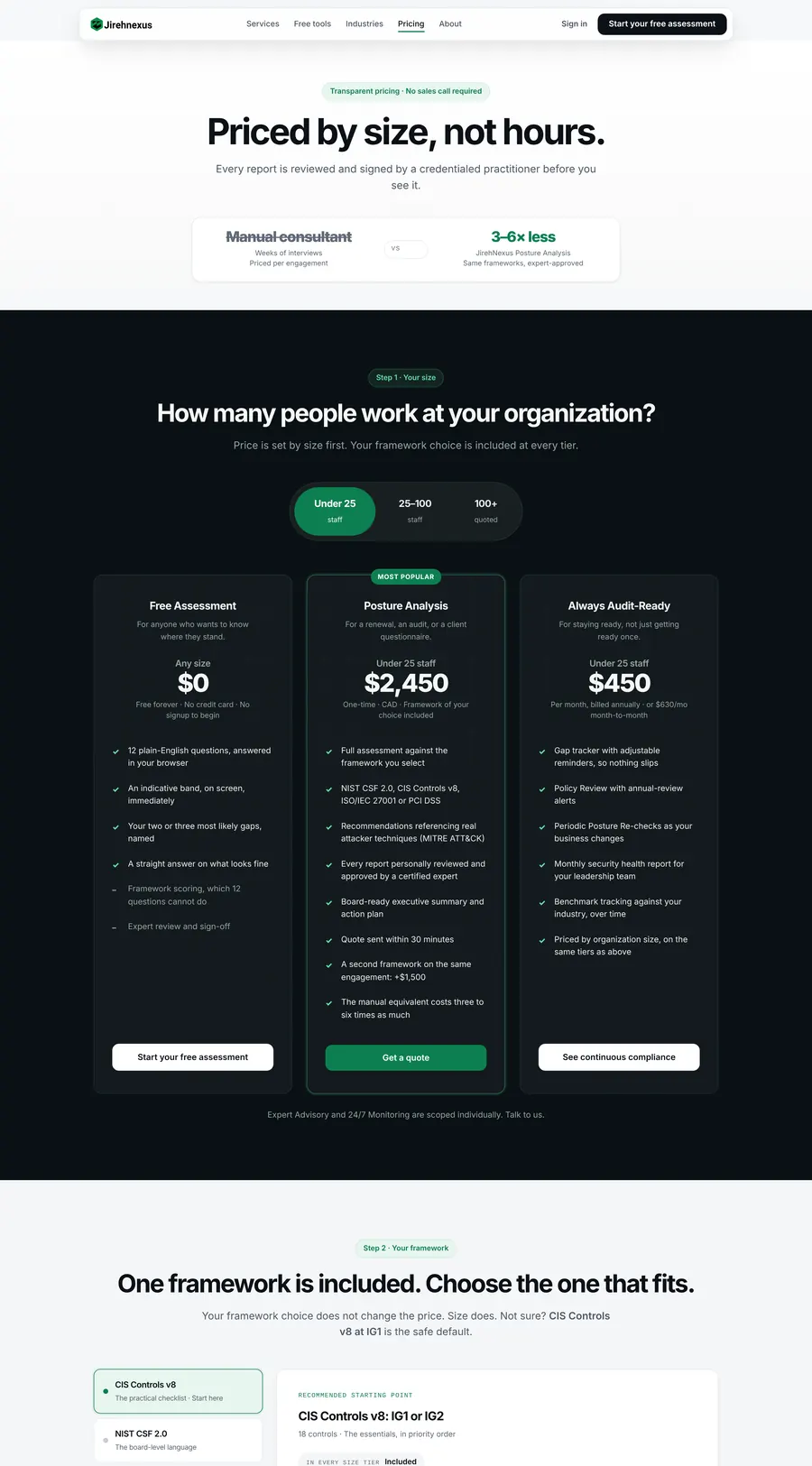
Size sets the price. The framework choice is included, a second framework is +$1,500. No dollar figure without its tier.

Score gaugeDrag
8.2 /10
Strong posture · expert approved

The band changes with the score. Free results show a band, not a number, so a 3.1 never lands as a verdict.

Self-checkPick an answer

Is there endpoint protection on every machine your people use?
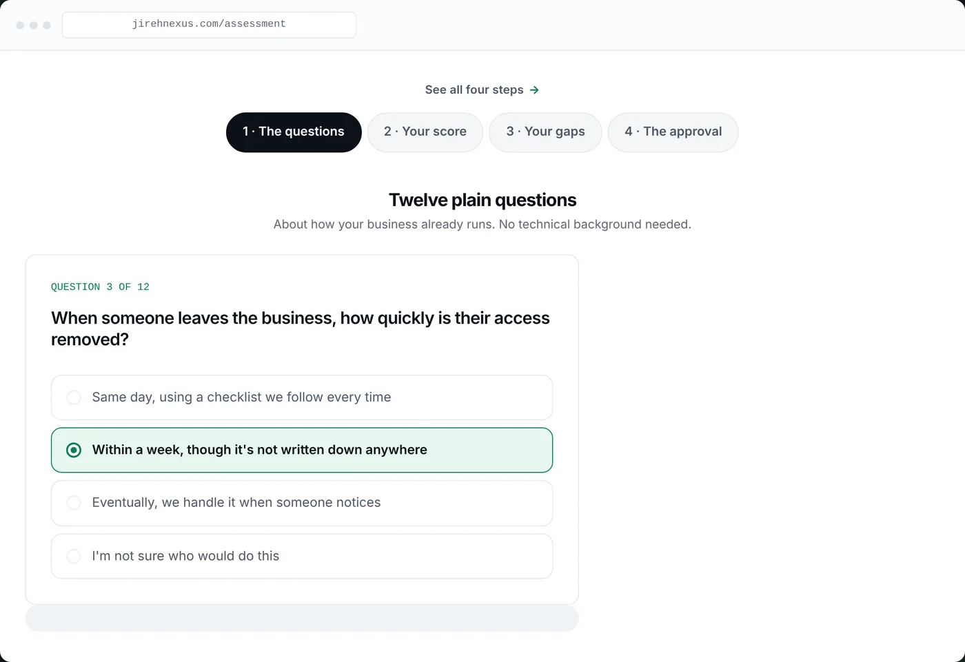
Your answers stay in this browser. Nothing is sent, nothing is saved.
Product tourClick a step
Tour step: the questions
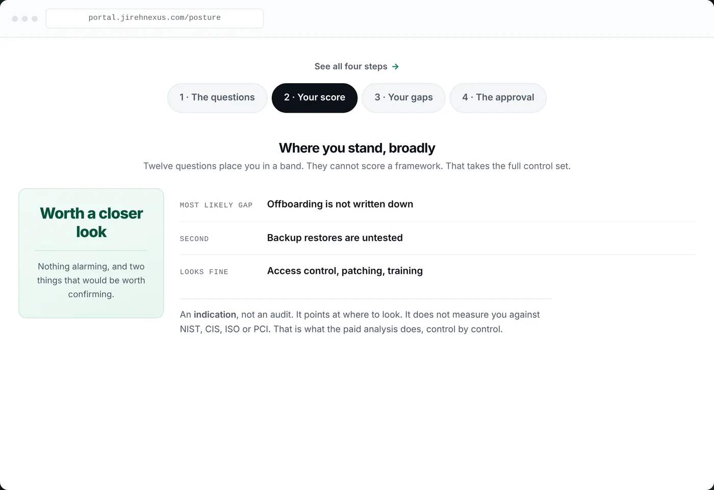
Tour step: your score
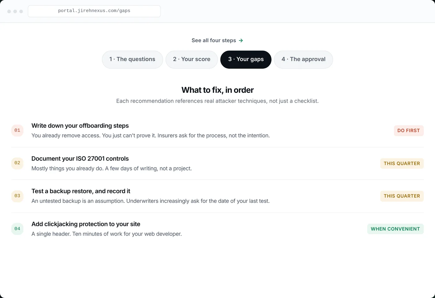
Tour step: your gaps
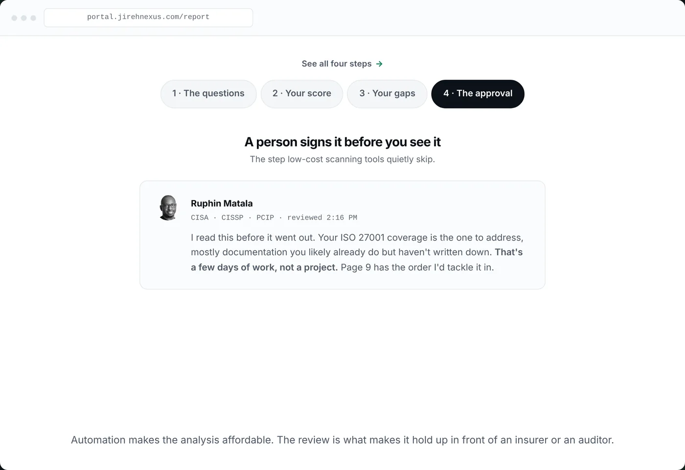
Tour step: the approval

The homepage hero is a four-step tour of the product inside a laptop frame, so the visitor sees the whole journey before scrolling.

Gap trackerHover
01
Write down your offboarding stepsYou already remove access. You can't prove it.
Do first
02
Document your ISO 27001 controlsA few days of writing, not a project.
This quarter
03
Test a backup restore, record itUnderwriters ask for the date of your last test.
This quarter
04
Add clickjacking protectionA single header, ten minutes.
When convenient

Ranked by priority, then effort. Every line says what, why an insurer cares, and how big the job is.

MascotMove your cursor
Jirehnexus mascot

On the live site the eyes track the pointer and the mascot stands 6px in front of the laptop frame. Both were lost twice by unrelated work, so a layout check now asserts them. Here it leans toward your cursor.

Approval recordClick approve
Ruphin MatalaCISA · CISSP · PCIP

I read this before it went out. Your ISO 27001 coverage is the one to address; mostly documentation you likely already do. That's a few days of work, not a project.

Not yet approved

Approval is a stored fact: who, which version, when. The report's value is that a named person stands behind it.

Buttons and ticksHover
No signup to beginAbout 10 minutesNothing to installYour result on screen

Black primary, outline secondary, green ticks for the four promises under every hero. The spring curve is the one from the design system.

Dome statScroll
0frameworks, scored separately
0controls at the widest, one at a time
0practitioner signs it before release

"Dozens of controls in. One number out." Counters run once, when first seen.

UI Accessibility

Measured, not assumed.

The launch audit found tertiary text failing AA in both themes at 3.62:1. It was retuned site-wide. Every pair below is from the shipped tokens.

Aa
15.0:1AAA
Ink on cool grey · all text
Aa
6.3:1AA
Green ink on white · links, labels
Aa
5.1:1AA
Tertiary on white · was 3.6, fixed
Aa
3.6:1Large only
White on brand green · meters, not labels
✓
Reduced motion throughoutIntro, tour, counters and reveals all switch off.
✓
Degrades without JavaScriptNo animation means no animation, never a blank page.
✓
Zero horizontal overflowChecked at 375, 768, 1024 and 1440.
✓
One H1 per page, all 24Titles, descriptions and alt text present.
✓
Visible focus states in tokensKeyboard reachable everywhere.
✓
Anchors clear the fixed navscroll-margin-top on every section with an id.
Chapter four

The screens.

Scroll through the homepage. The order is a persuasion arc, not a list of features.

jirehnexus.com
01 · Hero

See your security gaps.

Four promises under the headline, the mascot, and the product tour inside a laptop. The visitor sees the whole journey before scrolling.

Why: the buyer has never seen a posture assessment. Show the product, not the pitch.
02 · Ten minutes

Answer, score, approve.

Three cards: twelve questions, scored against the frameworks, a practitioner approves it.

Why: the three things that make it different from a quiz, in the order they happen.
03 · The dome

Dozens of controls in. One number out.

Four frameworks, 153 controls, one signature. The mascot holds the 8.2/10 report.

Why: the paid product's rigour, explained with three numbers instead of a paragraph.
04 · Trust band

Every report carries my name.

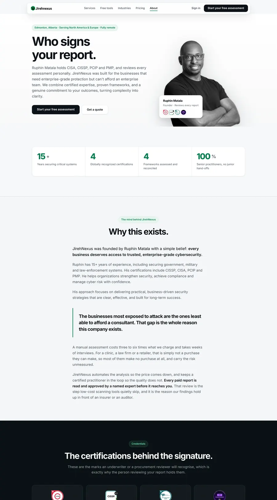
Ruphin's photo, four credential badges, fifteen years, and "Meet Ruphin". Added by the audit, right before the final ask.

Why: authentic credibility instead of fabricated testimonials. The business has no customers yet.
05 · Scrutiny

Built to hold up under scrutiny.

A dark closing band that states the standard the assessment is held to, then the free assessment CTA one last time.

Why: the last thing a sceptical CFO reads should be the quality bar, not a discount.
Screens Marketing site

Twenty-four pages, one voice.

Hover a page to scroll it. Every page opens with a plain-English headline and the four promises.
Pricing page
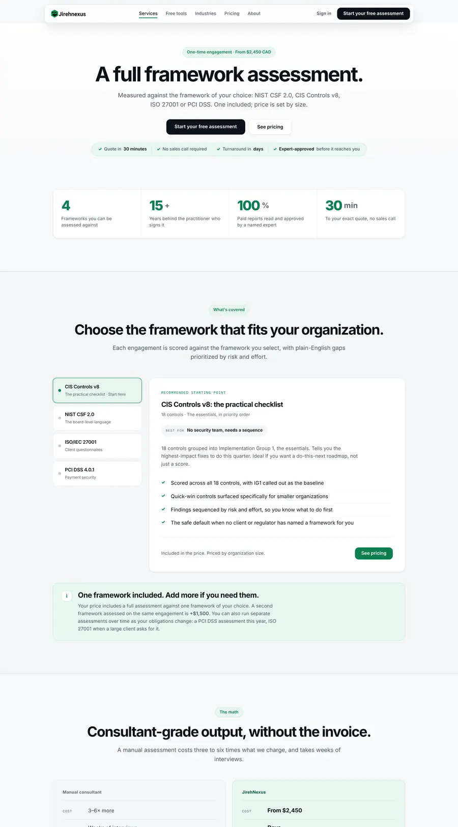
Pricing. Size first, then the three tiers, then "what is automated, what is not".
Posture Analysis service page
Posture Analysis. Framework picker, consultant comparison, the five-step engagement.
About Ruphin page
About. "Who signs your report." Credentials, why this exists, the four values.
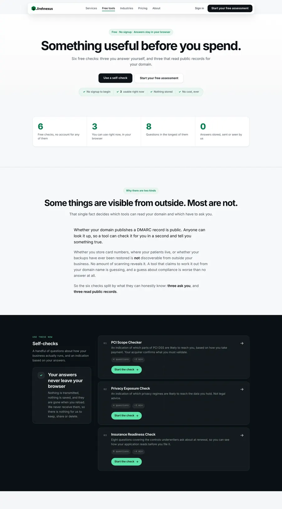
Free tools hub
Free tools. Three self-checks, three domain checks, each honest about what it can and cannot determine.
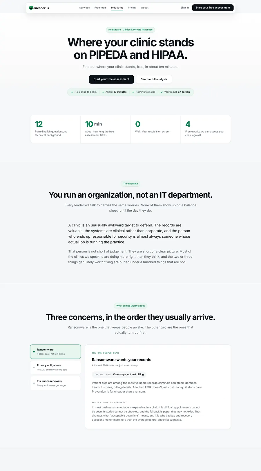
Healthcare industry page
Healthcare. One of four industry pages, each written for its regulator and its trigger event.
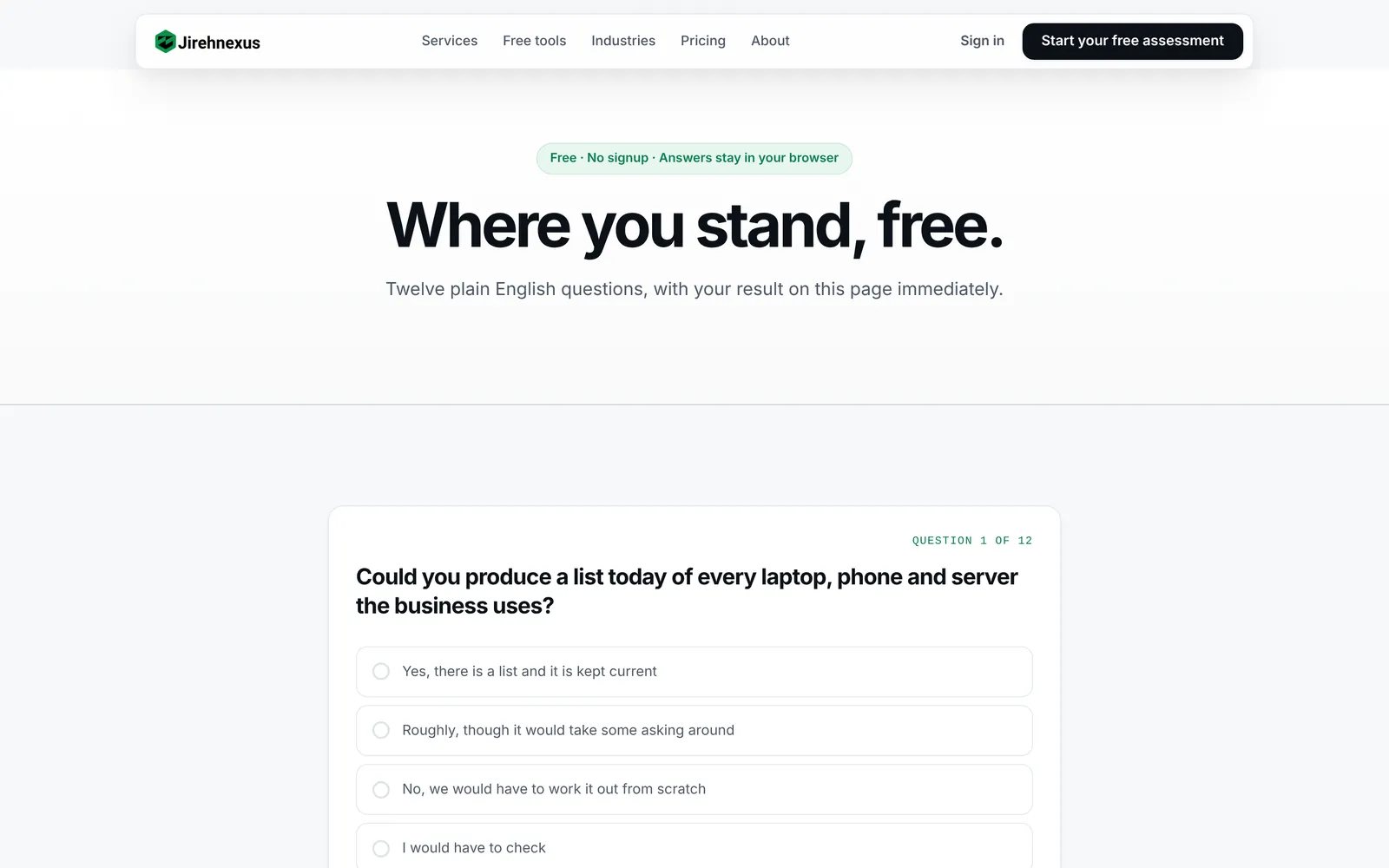
Free assessment page
Free assessment. "Where you stand, free." The question runner, then what the paid analysis adds.
Screens Customer portal and console

What the customer sees, and what Ruphin sees.

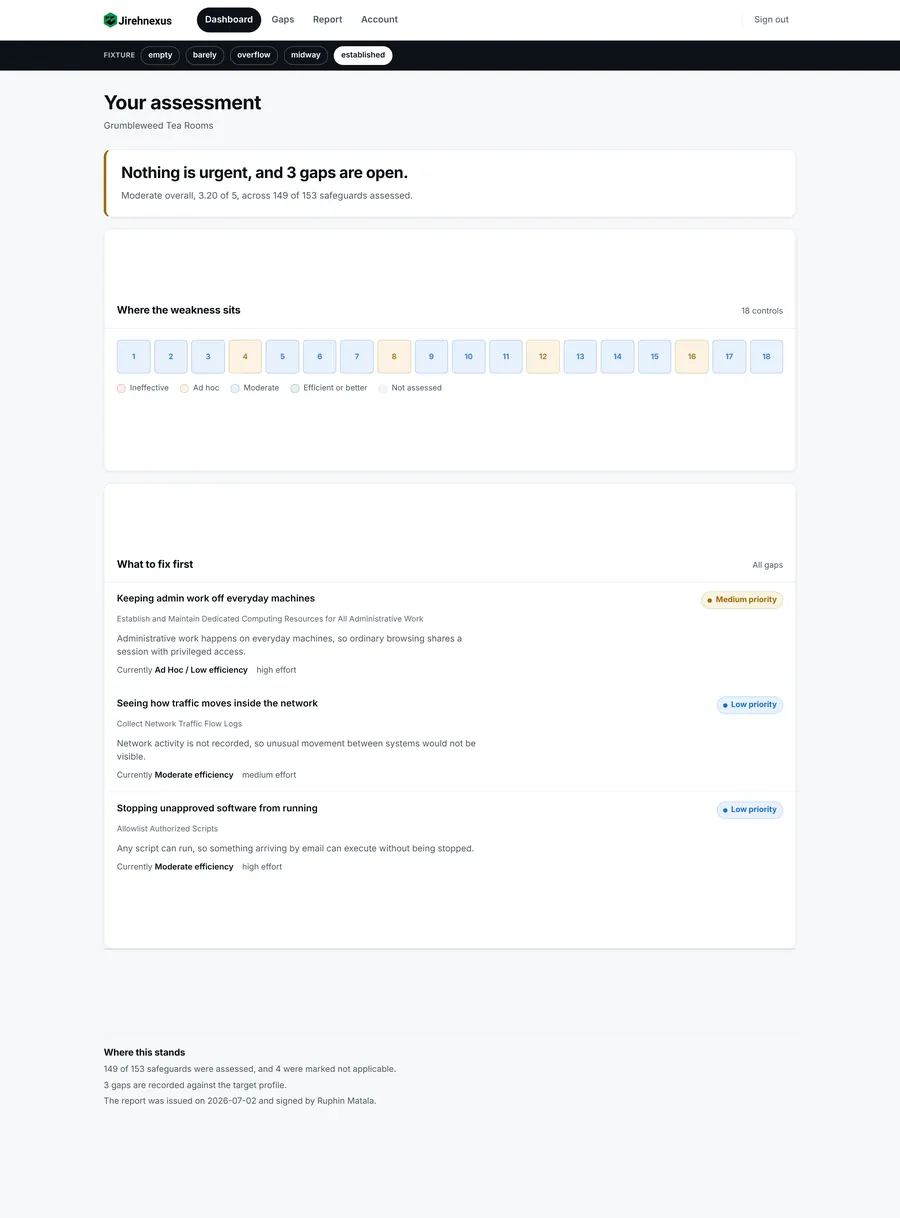
The portal renders against five fixture states, from "nothing assessed yet" to an established client, so empty states were designed, not discovered.
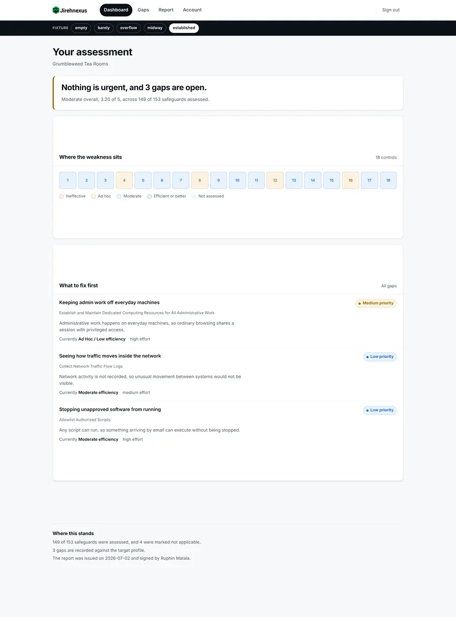
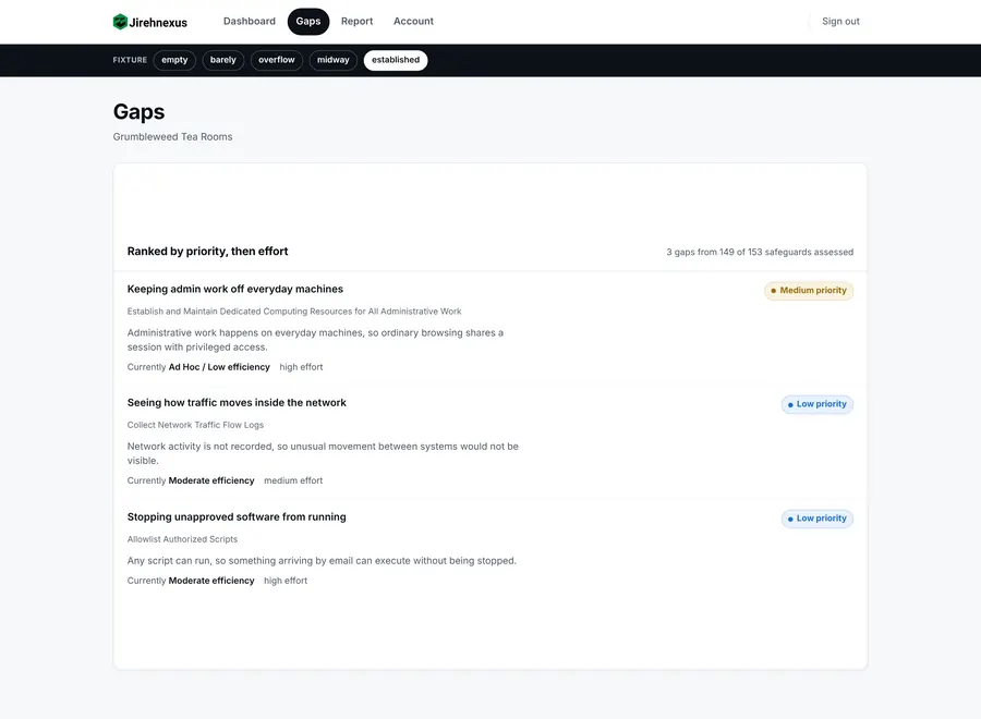
portal · dashboard
Portal dashboard, established client
Dashboard. "Nothing is urgent, and 3 gaps are open." Then where the weakness sits across 18 controls.
portal · gaps
Portal gap tracker
Gaps. Ranked by priority then effort, with the CIS safeguard named and the current efficiency rated.
portal · dashboard, new client
Portal dashboard, assessment midway
Midway state. The same dashboard with an assessment half done. Every state says what happened and what to do next.
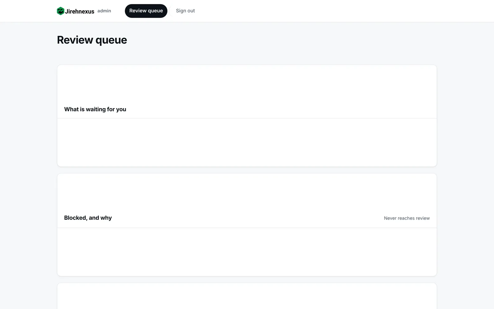
console · review queue
Review console
Review queue. What is waiting for Ruphin, and what is blocked and why, so it never reaches him.
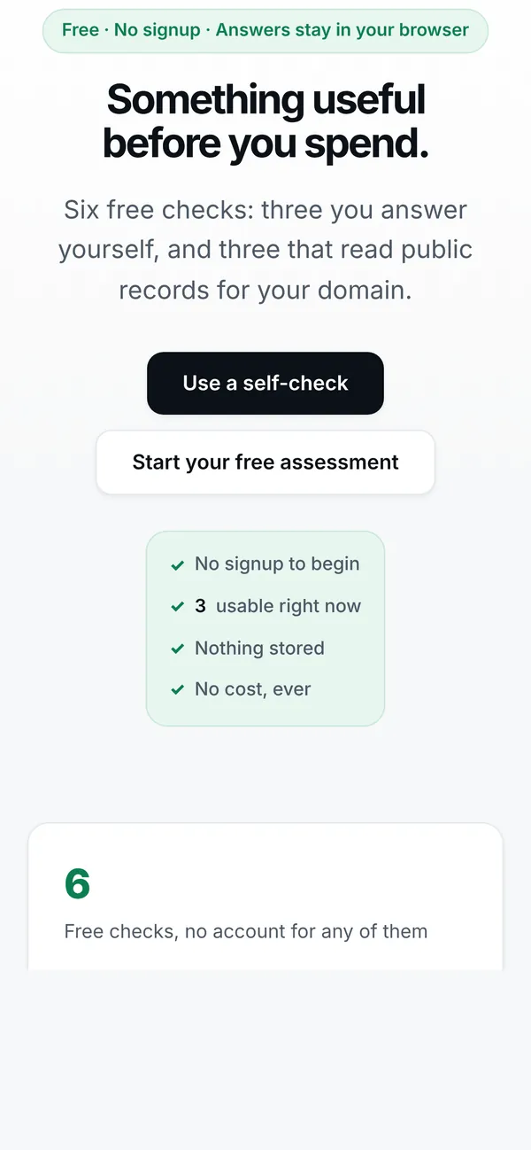
Screens Responsive

The clinic director reads it on her phone.

Every page checked at 375, 768, 1024 and 1440 with zero overflow. The hero sizes against the real viewport height, after it was found 49px below the fold on the most common laptop.
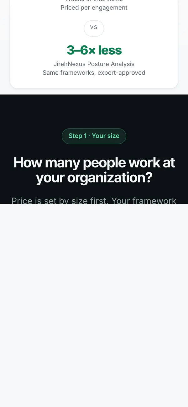
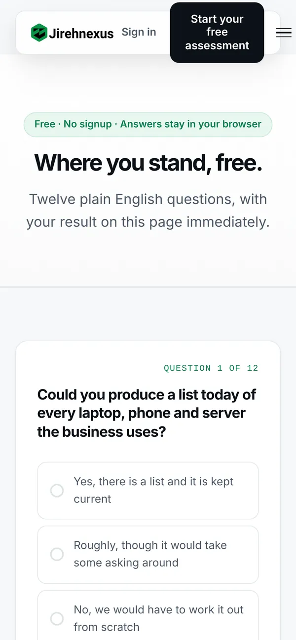
Pricing on mobile
Free assessment on mobile
Tools on mobile
Chapter five

Motion and micro-interactions.

Recorded on the build. Motion that happens once, means something, and switches off on request.

LIVE BUILD

Opening sequence

Trigger
Page load, once
Response
Headline, promises and mascot settle; the tour frame rises behind it
Why
A calm entrance for a buyer who is already anxious about security
LIVE BUILD

Product tour

Trigger
Click a step
Response
The laptop screen crossfades between questions, score, gaps, approval
Why
Four screens of the real product before the visitor scrolls
LIVE BUILD

Size selector

Trigger
Pick under 25, 25 to 100, 100+
Response
All three tier prices update together
Why
Size sets the price; framework is included. One control, no surprises
LIVE BUILD

Self-check

Trigger
Answer each question
Response
Progress bar fills, result worded as an indication, never a determination
Why
A tool that does not compute must not promise an outcome
LIVE BUILD

Portal dashboard

Trigger
Scroll, open Gaps
Response
Control strip, gap list, priorities
Why
A customer finds "what next" without reading the report
LIVE BUILD

Scroll reveals

Trigger
Scroll any page
Response
Sections rise once; the founder photo turns as you pass
Why
Paced reading for long pages, with no ambient loop anywhere
Principle 01OnceNothing loops. Motion happens on load, scroll or action and then rests.
Principle 02MeaningfulEvery animation explains a change of state. Decoration was cut.
Principle 03Spring, not bounceOne spring curve from the tokens, cubic-bezier(.34,1.4,.64,1).
Principle 04OptionalReduced motion respected everywhere. The audience skews 40s to 50s.
Build Engineering choices

No framework. No build step. Nothing to break.

A security company's website should be simple enough to audit by reading it. Three choices that follow from that.

01

Static HTML, one CSS, two JS files

Twenty-four pages share tokens, nav and footer injected from one array. Open index.html and it runs. There is no dependency to patch.

02

Honest tools

Six free tools. Three are self-checks that run entirely in the browser with no fetch and no storage. Three say plainly "this check is not live yet" until the backend lands.

03

Every check must be able to fail

Three audit checks passed everywhere because they measured the wrong thing. The rule now: prove a check fails on bad input before believing its pass.

Handoff Decisions logged for the founder

What we settled, and what only Ruphin can.

Commercial facts are not copy. Where the site said two different things, we fixed what we could and wrote the rest down.

Resolved
One framework or four?

Service page said all four, pricing said pick one. Settled: one included, a second is +$1,500.

Resolved
$4,750 or $4,000?

The PDF and the meeting disagreed. $4,750 is the 25 to 100 staff tier, a size tier, never a framework price.

Open
Free score out of 10 or 24?

The quiz scores /24; every other page promises /10. Recommendation: standardise on /10 so free and paid match.

Open
Is the sector benchmark real?

Promised in 24 places across 10 files, including the privacy policy. If no dataset exists, the copy changes and the pipeline loses a feature. Load-bearing.

06 Outcome

A product a one-person firm can actually run.

From a research document to four working surfaces, with the founder's judgement protected and every unresolved commercial question written down rather than guessed.

Product

Strategy

  • Sourced market and threat research
  • Competitive gap and pricing validation
  • Four-tier service ladder, 12 product decisions
  • The automation principle: 153 to 30
UX

Structure

  • Personas with trigger events
  • Seven-step free funnel
  • IA for site, portal and console
  • Twelve questions, derived not picked
UI and build

Product

  • Design system, light only, token-driven
  • 24 pages, 6 tools, portal, console
  • Mascot, tour, dome, trust band
  • Six-lens launch audit, contrast fixed
What we learned
Cheap must look carefulAt 15% of a consultant's price, every pixel has to argue for rigour. Plain English, sourced numbers, a named signature.
Every defect was a silent passNothing in this project ever broke loudly. The discipline became: write the failing case first.
Write the decision downA strategy document as single source of truth meant twelve decisions were made once, not re-argued per milestone.

More work from the studio

A few other projects we've designed and built.
Explore more works

Got an idea?

Let’s build something worth noticing

Let’s talk