



Case studyProduct design · UX · UI

Recalc Academy.Making finance teamsfaster at spreadsheets.

A premium learning platform selling spreadsheet training to corporate teams. We shaped the product, mapped who buys and why, and designed a calm, confident website that feels as sharp as the bankers who built the courses.

Product strategyUser researchPersonas & flowsWireframesUI & design system
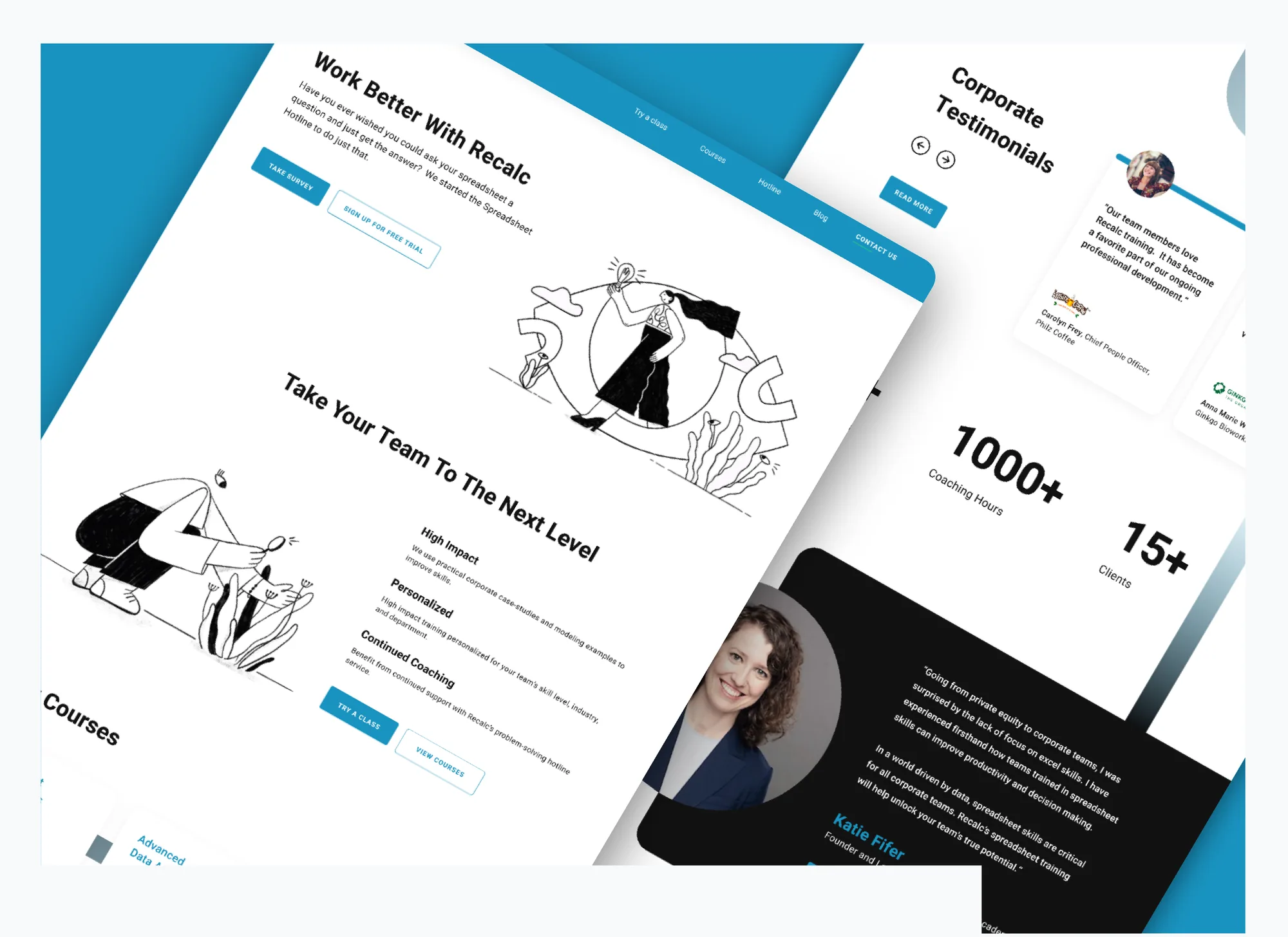
Recalc Academy website designs shown in perspective
Client
Recalc Academy
Industry
EdTech · B2B training
Audience
Corporate finance teams
Platform
Responsive website
Base
San Francisco, CA
00 Overview

Premium training deserves a premium front door.

Recalc's courses are designed by banking, consulting and private equity leaders. The website had to sell that credibility to three very different buyers, from an analyst paying for herself to a business owner training 5,000 people.

Challenge

Three buyers, one site

An analyst, a finance director and a business owner all land on the same homepage, each wanting proof of a different kind.

Approach

Guide, then prove

A short survey recommends the right course, a free trial class lowers the risk, and corporate testimonials do the convincing.

Outcome

A complete system

Personas, flows, wireframes, a design system and responsive UI for the home, course, testimonials, FAQ and contact pages.

01 Process

Six steps, one decision at a time.

Every step ended with a sign-off, so the visual design was never asked to fix a strategy problem.

01

Understand

The business and its why.

  • Why · How · What
  • Company brief
02

Empathise

Who buys, and what they fear.

  • 3 user personas
  • Goals & pain points
03

Define

Paths and priorities.

  • Journey map
  • Sitemap & flows
04

Explore

A visual language.

  • Moodboard
  • UI trends
  • Principles
05

Structure

Layout before looks.

  • Section library
  • Wireframes
06

Design

The final interface.

  • Design system
  • Responsive UI
Chapter one

Product design.

Start with why the company exists, then work out what the product must do for each kind of buyer.

Golden circleProblem framingBuying modesProduct decisions
Product About the company
WHY

Help corporate teams outperform and accelerate career growth.

HOW

Improve productivity by delivering timely, relevant and actionable information to support critical leadership decisions.

WHAT

Essential spreadsheet courses for corporate teams, designed by banking, consulting and private equity leaders.

Problem statement

Finance professionals lose hours to slow spreadsheet work, and the people who pay for training, from analysts to CEOs, each need different proof before they commit.

Insight Three buying modes

Same course, three ways to buy it.

Research showed one product sold three ways. That became the spine of the site: every page offers a path for yourself, your team or your company.

01

For myself

An individual paying to get faster and stand out. Needs the right level and a clear outcome.

Emily, analyst
02

For my team

A leader raising the bar for a department. Needs a trial, a proposal and proof from peers.

Lauren, finance VP
03

For my company

An owner building a world-class workforce. Needs scale, retention benefits and trust.

Cody, business owner
Decisions What the product must do

Four bets that shaped the design.

Each one answers a specific pain point from the personas.

01

A survey before a catalogue

"Take a short survey and we'll suggest the best course." Three questions beat browsing a list of courses you can't judge yet.

Answers: "can't find the perfect solution"
02

A free trial class

Corporate buyers rarely commit blind. A trial for one person or a whole team removes the risk.

Answers: "hasn't found the perfect solution"
03

The Spreadsheet Hotline

"Ever wished you could ask your spreadsheet a question?" Continued coaching makes Recalc more than a one-off course.

Answers: "employees stick to inefficient methods"
04

Proof from the boardroom

Corporate testimonials, client logos and the founder's own story sit on the homepage, not buried on an about page.

Answers: "keep up with the company reputation"
Chapter two

UX design.

Who they are, how they decide, and the shortest path from interested to enrolled.

User personasJourney mapInformation architectureUser flowsWireframes

Finance Director / VP Seeking classes for teams

Lauren worked with many large corporates before joining Impact (25,000+ employees), drawing on 12 years in investment banking. She believes in aligning her people with the company vision and wants an overarching philosophy for how the company can perform even better.

Goals
  • Keep up the company reputation and beat past performance
  • Implement non-traditional strategies
Needs
  • Raise the bar and put best practices in place
  • Implement workforce transformation practices
Pain points
  • Dearth of responsible workforce
  • Employees stick to inefficient methods
  • Sees room for improvement, hasn't found the solution
Personality

Investment Banking Analyst Seeking classes for self

Emily started her career five years ago and worked hard to become an analyst. She knows the tools but wants to be faster and more efficient without compromising quality, and is looking for skills that set her apart.

Goals
  • Climb the corporate ladder
  • Balance life and work while producing top-quality work
Needs
  • Action plans that maximise efficiency
  • Learn new and upcoming industry tricks
Pain points
  • Long hours to meet company standards
  • No work-life balance
  • Wants a course that matches her real tasks
Personality

Business Owner Seeking company-wide classes

Cody is a true entrepreneur with 12 years in private equity. After a few failed start-ups he has run NextCorp, a consulting firm, for six years and grown it to 5,200 people. The company is expanding and he wants nothing but the best work.

Goals
  • Build a world-class business
  • Build a team of highly able professionals
  • Expand services and headcount
Needs
  • The best processes in place
  • Guide the workforce to improve
  • Retain people for longer
Pain points
  • Substandard work quality
  • People switch jobs often
  • Unmotivated, under-trained workforce
Personality
UX Journey map

Lauren's path from doubt to rollout.

The team buyer has the most at stake. We mapped her journey so each low point has a design answer waiting.

Stage
NoticeTeam is slow
SearchFinds Recalc
EvaluateCompares options
TrialTeam tries a class
Roll outOngoing coaching
Thinking
"We keep missing deadlines on simple models."
"Another generic online course?"
"Will this fit how my team actually works?"
"Let's see if they engage."
"How do we keep the skills sharp?"
Feeling
Pain point
PAINNo clear fix in sight
PAINEvery course looks the same
PAINUnsure of fit and level
PAINRisk of low adoption
PAINSkills fade after training
Design answer
ANSWERBlog articles on spreadsheets at work
ANSWER"Designed by banking and PE leaders"
ANSWERSurvey recommends the right course
ANSWERFree trial class for your team
ANSWERHotline and continued coaching
UX Information architecture

Five doors, one destination.

The main navigation mirrors the questions buyers ask: can I try it, what will I learn, can I get help, what do others say, how do I start?

HomeSurvey · courses · testimonials · founder
Try a classLow-risk entry
Course survey3 questions
Free trialSelf or team
CoursesWhat you'll learn
Spreadsheet FundamentalsFor beginners
Advanced Data AnalysisExperienced users
Forecasting & ModelingFinance teams
HotlineContinued help
Ask a questionQuick answers
Learner storiesProof
CorporateTestimonials
StudentsTestimonials
BlogArticles & video
ContactStart
Corporate or individualSmart form
FAQObjections
UX User flows

A path for every buyer.

Flows were drawn before any screen, one per persona. Choose a flow.

Blog or searchEntry
Homepage"Work better"
Take survey3 questions
Level?Decision
Course pageSkills & outcomes
Enquire nowEnrolled

The survey replaces guesswork. Emily lands on the course that matches her level instead of judging three similar titles.

Search or referralEntry
Homepage"Take your team to the next level"
TestimonialsPeer proof
Trial class for your teamCTA
Corporate or individual?Form field
Get in touchTrial booked

One form serves both audiences. Choosing "Corporate" routes Lauren to a team conversation, not a self-serve checkout.

LinkedIn or eventEntry
HomepageFounder story
Client logosTrust
HotlineOngoing value
FAQ"Can I subscribe my team?"
ContactCompany-wide plan

Cody cares about retention, so continued coaching and the Hotline appear before he is asked to talk to sales.

Key pageDecisionGoal reached
UX Wireframes

Structure first, style second.

Low-fidelity layouts settled hierarchy and calls to action. Drag to see how the homepage hero evolved, then hover a wireframe to scroll it.

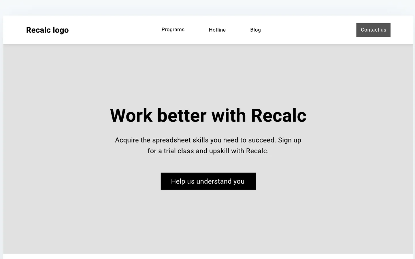
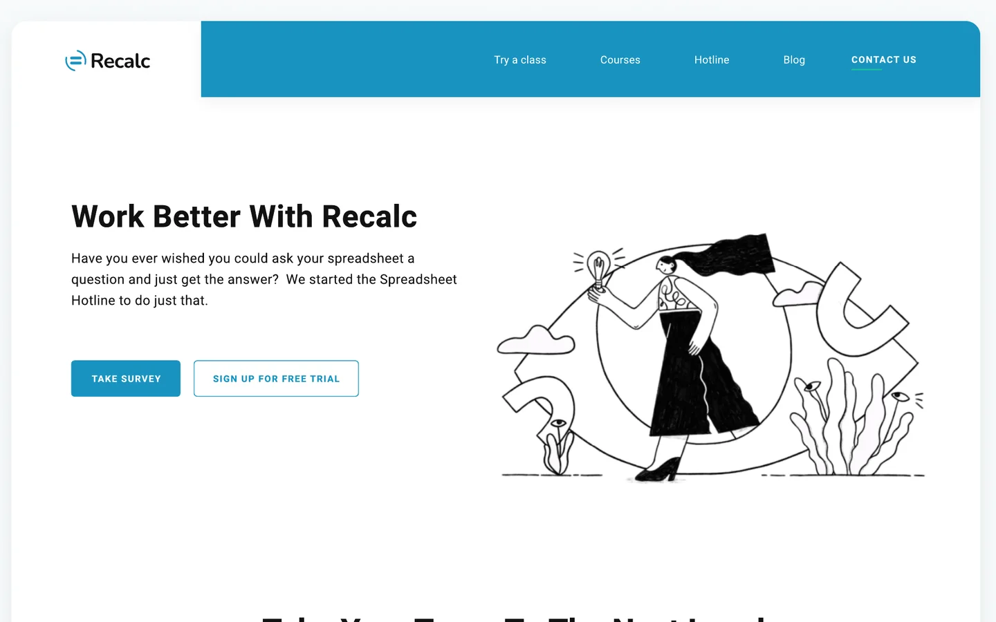
Final homepage hero
Homepage hero wireframe
WireframeFinal UI
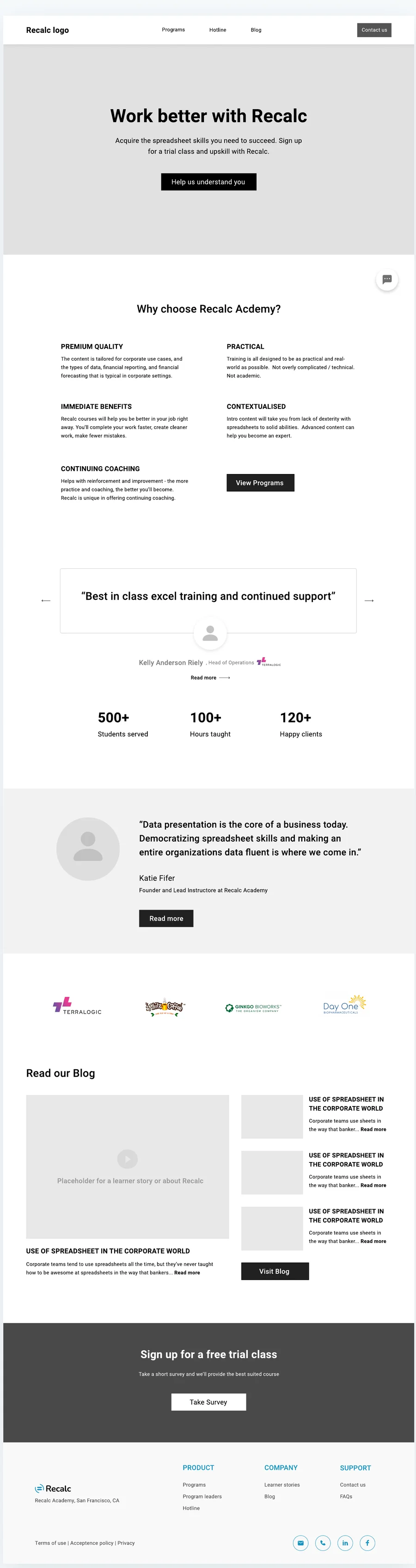
Homepage wireframe
Home. Value, reasons, proof, blog.
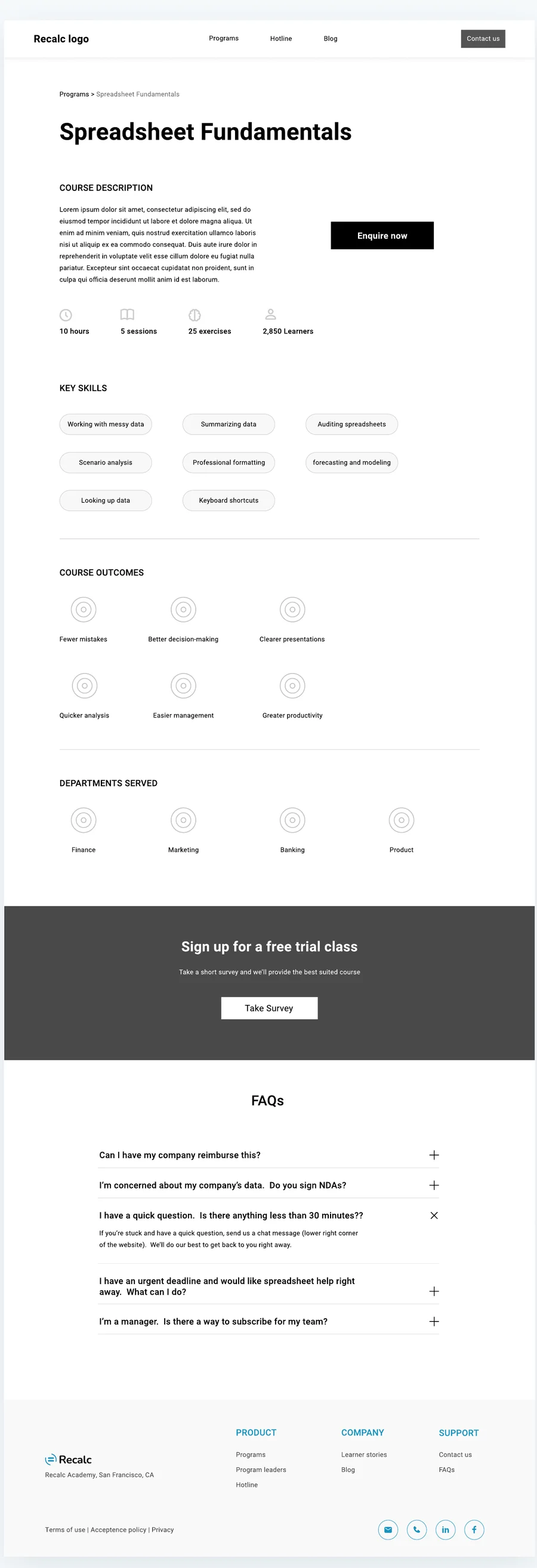
Course page wireframe
Course. Skills, outcomes, FAQ.
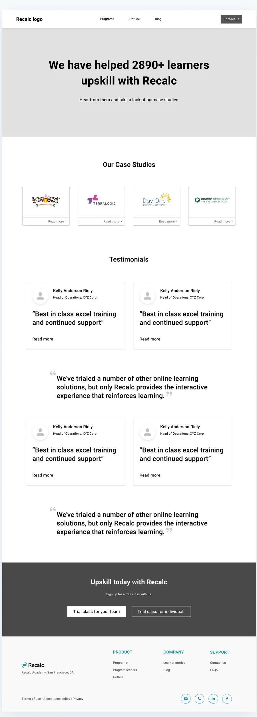
Case studies wireframe
Learner stories. Logos and quotes.
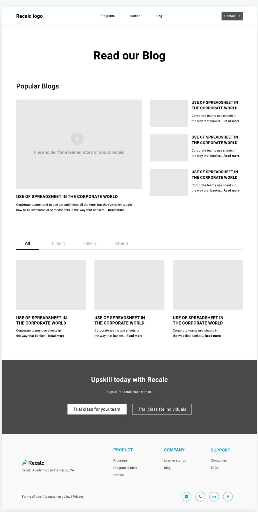
Blog wireframe
Blog. Popular and filtered.
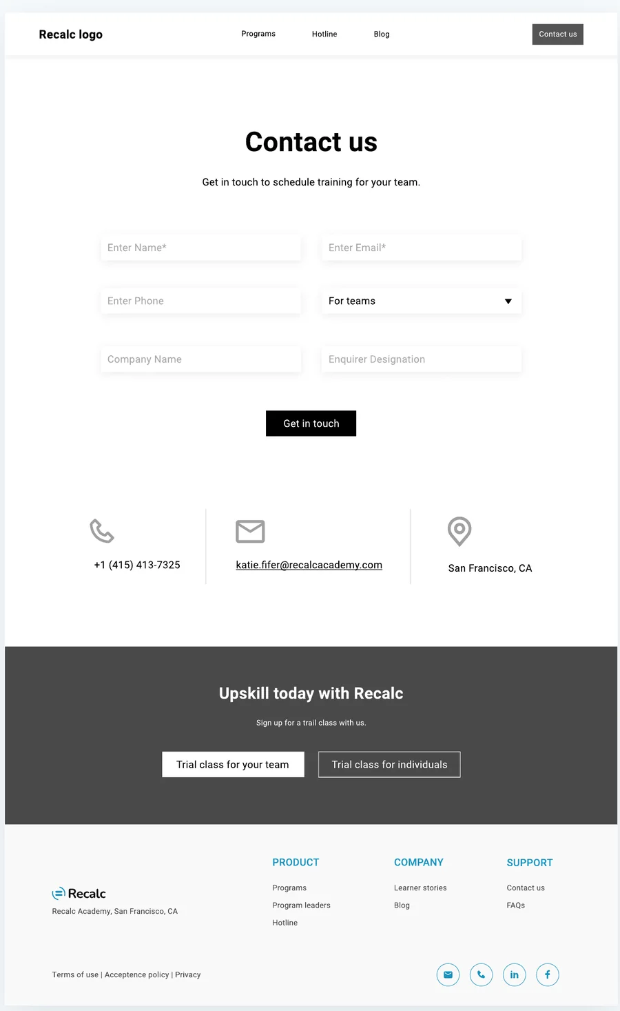
Contact wireframe
Contact. One smart form.
Chapter three

UI design.

Black, white and one confident blue. A visual language as precise as a well-built model. Components below are live.

PrinciplesUI trendsDesign directionColourTypographyComponentsAccessibility

Company brief

  • A high-end, premium learning platform
  • Exclusive in its service
  • A niche corporate client base
  • Highly contextual and practical

Brand identity

ProfessionalStrongPremiumIntellectualSophisticated
UI Trends we borrowed

Four trends, chosen on purpose.

We studied current UI trends and kept only those that serve a premium, practical brand.

UI Design direction

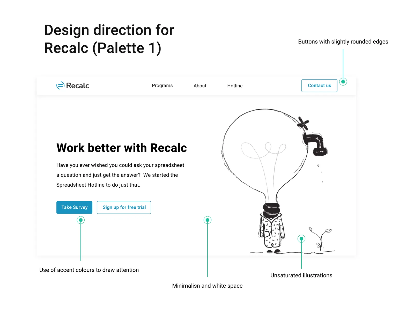
Every choice has a reason.

Accent colour for actions, white space for calm, slightly rounded buttons and unsaturated illustrations. Each one was a deliberate call.

Annotated design direction for the Recalc homepage hero
UI Colour

Mostly black and white. Blue for what matters.

The platform lives in black, grey and white, so blue can highlight images, key information and sections. Click a swatch to copy it.

Typeface · Heebo
AaHeebo BoldABCDEFGHIJKLMNOPQRSTUVWXYZ
abcdefghijklmnopqrstuvwxyz
1234567890
AaHeebo RegularABCDEFGHIJKLMNOPQRSTUVWXYZ
abcdefghijklmnopqrstuvwxyz
1234567890

A sans serif with sharp corners and straight edges. Crisp sans serifs read as modern, elite, premium and clean.

Type specimen
About us
Upskill with Recalc Academy today

Essential spreadsheet courses for corporate teams designed by banking, consulting and private equity leaders. Start your journey with us.

H1Work better with RecalcBold · 44/1.1
H2Take your team to the next levelBold · 30/1.2
H3Spreadsheet FundamentalsBold · 20/1.3
BodyWe use practical corporate case studies and modelling examples.Regular · 16/1.6
ButtonTake surveyBold · 13 caps
UI Components

A section library, then live parts.

Reusable sections kept pages consistent. The components below are coded from the design: hover, click and type to see their states.

ButtonsHover · press

Solid for the main action, outline for the safer one. Slightly rounded, as the direction asked.

Course cardHover
Spreadsheet FundamentalsFor beginners
Read more →
Forecasting & ModelingFor finance teams
Read more →

The blue edge grows on hover, echoing the line that links courses on the homepage.

Testimonial sliderClick arrows
"Our team members love Recalc training. It has become a favourite part of our ongoing professional development."Corporate testimonial · Chief People Officer
"Coming from private equity into a corporate leadership role, I could immediately see the value in Recalc training."Corporate testimonial · CFO & SVP
"We've trialled a number of other online learning solutions, but only Recalc provides the interactive experience that reinforces learning."Corporate testimonial · Founder
Contact formType · submit
Get in touch to schedule training for your team.
FAQ accordionClick
If you're stuck and have a quick question, send us a chat message from the lower right corner of the website. We'll do our best to get back to you right away.
Use the Spreadsheet Hotline to ask your question and get help fast.
Yes. Start with a trial class for your team and we'll plan the rest together.
StatsScroll
0+Course attendees
0Coaching hours
0+Clients

Numbers count up once, the first time they're seen. Proof feels earned rather than shouted. Figures shown as designed in the UI.

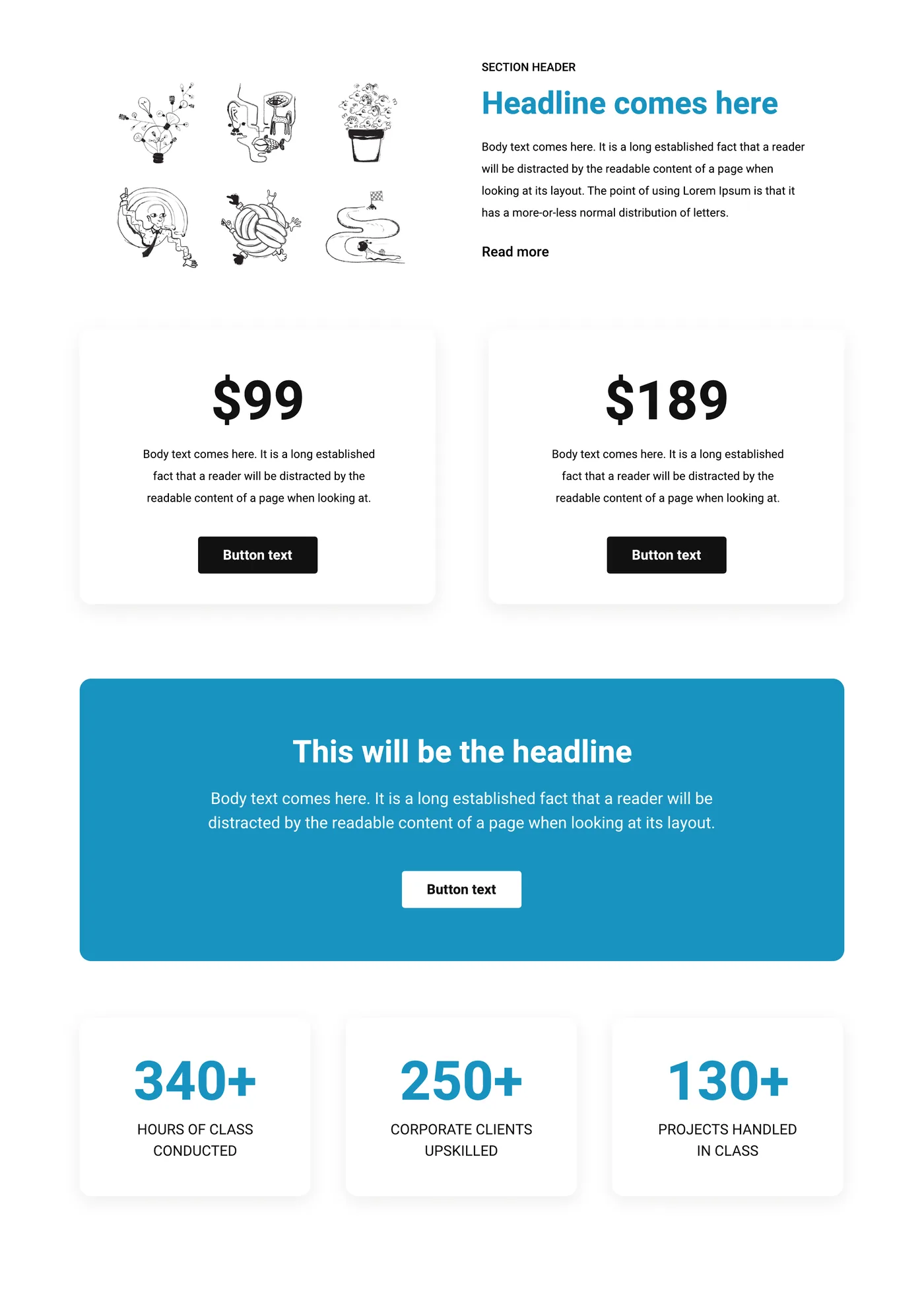
Recalc section and component library
Section library. Headers, pricing cards, banners and stat blocks, designed once and reused across every page.
UI Accessibility

Premium means readable by everyone.

We checked every colour pair against WCAG 2.2. The brand blue is perfect for fills and large type, but too light for small text on white, so the system adds a deeper ink blue.

Aa
18.7:1AAA
Ink on white · all text
Aa
3.5:1Large only
Recalc blue on white · headings 24px+
Aa
4.6:1AA
White on ink blue · buttons, links
Aa
5.3:1AA
Recalc blue on ink · dark sections
✓

Refinement: small blue text and button labels move to Ink blue #147EA6. The brand blue stays for illustrations, fills and big headlines, so the look is unchanged and every label passes AA.

Chapter four

The screens.

Scroll through the homepage. Each section answers the next question a buyer has.

Recalc Academy · Home
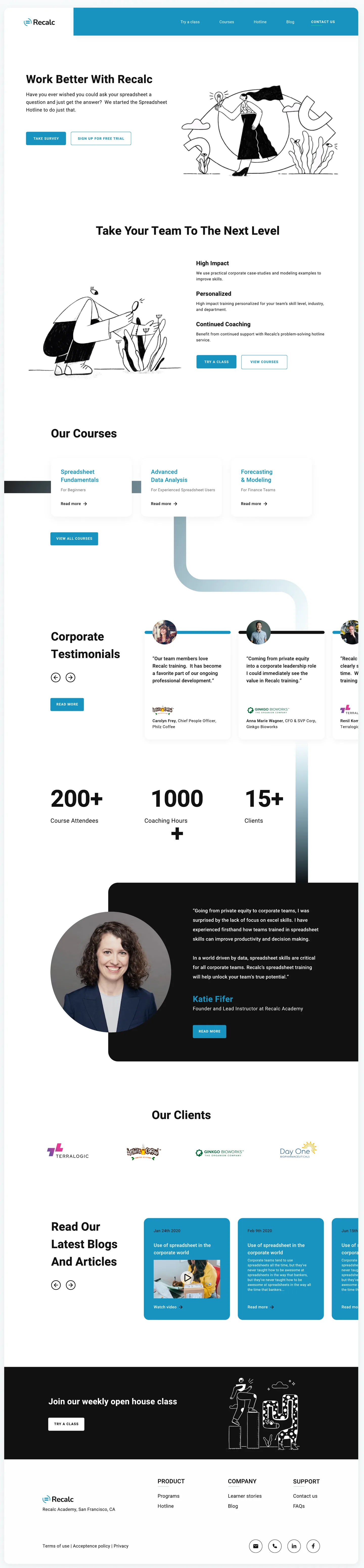
Full Recalc homepage design
01 · Hero

Lead with a question they've asked.

"Ever wished you could ask your spreadsheet a question?" Two actions: take the survey, or try a class free.

Why: naming a real frustration earns attention faster than a feature list.
02 · For teams

Speak to the team buyer.

High impact, personalised and continued coaching. Three reasons, one illustration, two actions.

Why: Lauren needs outcomes for her team, not course syllabi.
03 · Courses

Three courses, one clear ladder.

Fundamentals, advanced analysis and forecasting, each labelled with who it's for and joined by a single line.

Why: labels like "For finance teams" let people self-select in a second.
04 · Proof

Let the boardroom talk.

Corporate testimonials with logos, then three big numbers.

Why: senior buyers trust peers more than marketing copy.
05 · Founder

Put a face on the expertise.

The founder's own story, set on black to break the rhythm and slow the reader down.

Why: "designed by banking leaders" is only believable with a real person behind it.
06 · Close

Keep the door open.

Client logos, latest articles and a weekly open house class for anyone not ready yet.

Why: a free, low-commitment next step catches buyers who aren't ready to talk to sales.
Screens Inner pages

Same system, every page.

Hover a page to scroll through it.

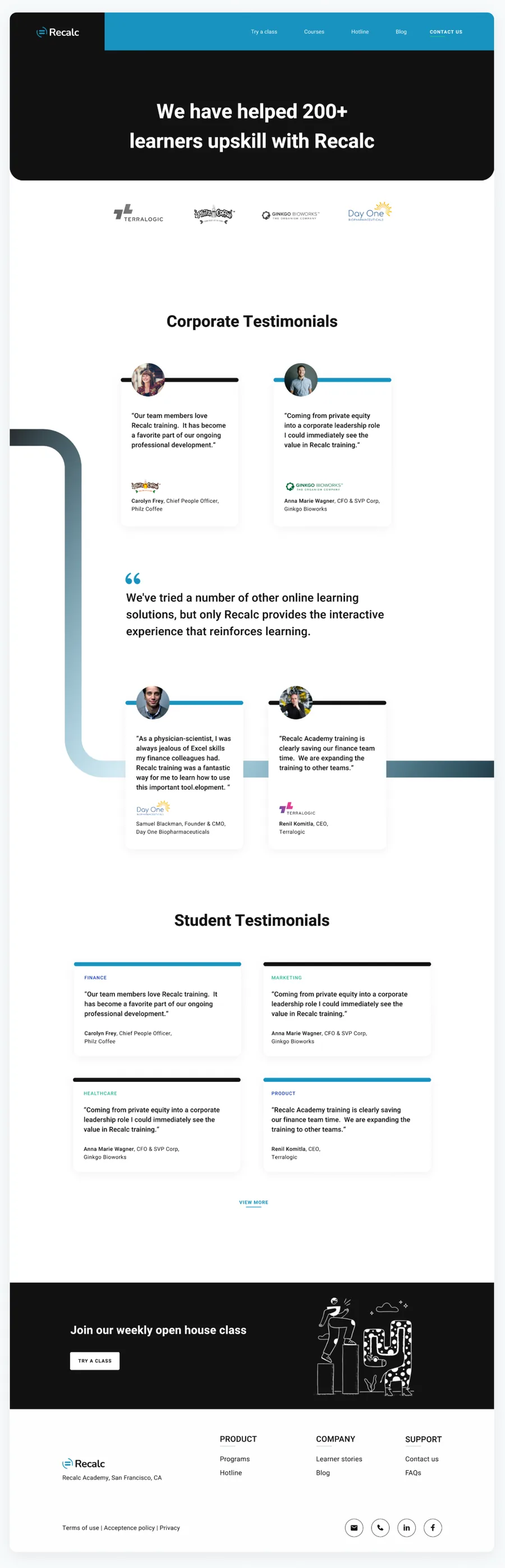
/learner-stories
Learner stories page
Learner stories. Corporate and student testimonials joined by a flowing line.
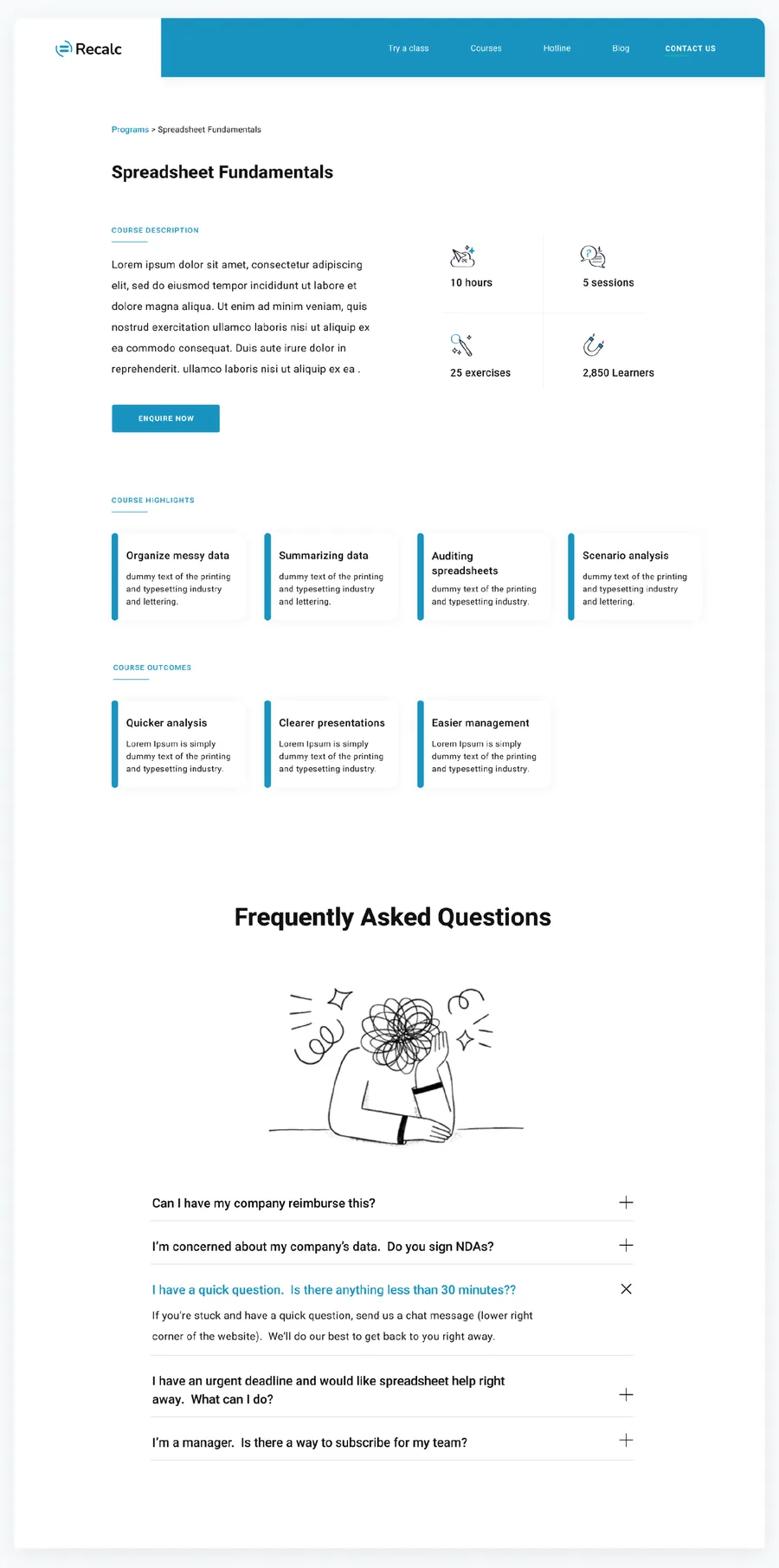
/courses/fundamentals
Course detail and FAQ
Course & FAQ. Key facts, skills, outcomes and the questions buyers really ask.
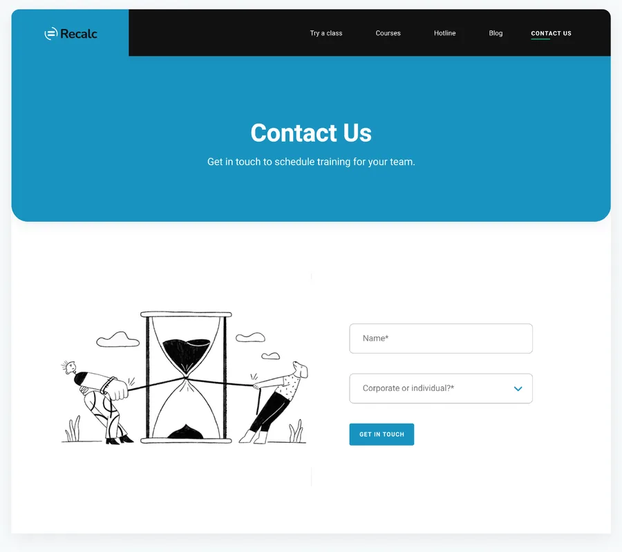
/contact
Contact page
Contact. Two fields and a "Corporate or individual" choice.
Recalc homepage on mobile
Responsive Mobile

Built for the commute.

Busy professionals read on the go, so every section was redesigned for one column, not just squeezed.

1
One primary action"Sign up for free trial" leads; the survey sits one tap away.
2
Cards stack, labels stayEach course keeps its "For beginners" tag so it still self-selects.
3
Swipeable proofTestimonials become a horizontal carousel with arrows.
05 Interactive prototype

Try the course finder.

The "Take survey" button is the heart of the product. We prototyped it in code to test the questions and the tone. Go on, take it.

Help us understand youQuestion 1 of 3
Question 1

Who is the training for?

Question 2

How confident are you with spreadsheets?

Question 3

What do you want to get better at?

Your match

We recommend

Spreadsheet FundamentalsFor beginners
    Prototype
    Three questions, no moreEnough to route each persona, short enough to finish on a phone.
    Answers, not formsBig tappable options with a one-line hint remove the fear of choosing wrong.
    A result with a next stepTeams get a team trial, individuals get a free class. No dead ends.
    Spreadsheet Hotline · concept
    Try =XLOOKUP(A2, Sales!A:A, Sales!C:C, "Not found") to pull each rep's total in one step.
    06 Outcome

    A product ready to sell itself.

    From why the company exists to the last pixel of the contact form, every decision traces back to a persona and a goal.

    Product

    Strategy

    • Why · How · What framing
    • Three buying modes
    • Four product decisions
    UX

    Structure

    • 3 detailed personas
    • Journey map & sitemap
    • 3 flows, 5 wireframes
    UI

    Interface

    • Moodboard & principles
    • Colour, type & section library
    • Responsive home and inner pages
    What we'd measure after launch
    Survey completionDo people finish all three questions?
    Trial bookingsTeam trials vs individual trials
    Hotline useQuestions per active learner
    Form mixShare of "Corporate" enquiries

    More work from the studio

    A few other projects we've designed and built.

    Explore more works

    Got an idea?

    Let’s build something worth noticing

    Let’s talk